Blog...
A blog post is loading...
Jan 1, 2025
Loading…
A blog post is loading...
Jan 1, 2025
Loading…
I started a talk deck on a plane with only an iPad, then let Codex finish it. The four steps that made that work, and the whole session as receipts.
Nov 4, 2026
Last summer I gave a talk to my founder forum called Anatomy of an Agent Harness. Afterward, people asked how I made the deck.
It started on a plane.
I was flying home from New York with nothing but an iPad. I sat and thought for a while. I drew two rough sketches. I answered a lot of questions. Then I turned the iPad off and went home. Codex kept going, and by the time I really looked again, the deck was mostly done.
Codex made the slides. My job was to get what was in my head into a form it could keep using without me.
That last part matters more than it sounds. On a long task, an agent can't hold everything it has been told. Every so often it compresses the conversation to make room, and compression loses detail. A document doesn't. So every step below ends with something written down that the agent can reload, exactly as written, hours later.
I didn't have an outline. I had this:
 The sketch I started with, drawn on the iPad.
So I didn't write the brief. I had Codex write it, by interviewing me until I was exhausted.
The trick is in how you answer. Ask for multiple-choice questions, because they're quick to read and they show you what the agent is assuming. Then, whenever you can, skip the options. Pick Other and talk. I'd dictate several paragraphs into the text box for a single question: what I meant, why, the story behind it, the part I wasn't sure about. Agents are good at turning a pile like that into decisions. A click gives them one word.
Of the 104 questions Codex asked me, I typed my own answer to more than half, about 4,300 words in all. One interview about the slides ran for more than an hour.
The step ends with a document. I had Codex turn every answer into a master plan, a markdown file written as prose with the reasons kept in. From then on, that file was the talk.
See the interviews in the session
I went in with a feeling, not a style: something raw that becomes more refined over time. I'd even drawn it, badly, as one model growing from autocomplete into an agent.
 My version, on the iPad.
Talking it through with Codex turned that feeling into a cast. A model starts as raw material: the internet, compressed into one rigid, sharp-edged shape. Becoming an agent is the process of smoothing those edges off. The ports on the rounder shape are where tools and data plug in. And once it's round, inside a harness, it can roll.
 Codex's version: the same model, getting rounder as it learns.
I love this metaphor, and that matters more than it sounds. A good metaphor does a lot of the explaining for you, and it gives every later slide a character to reuse.
Same ending: the characters, and the rules for drawing them, went into the master plan, so every later image could start from the same description.
Here is where most people go wrong. The agent wants to make the deck, so it pushes you to make the deck, and you end up waiting for it and reacting to whatever comes back.
I asked for an outline instead: titles, bullets, and a description of each slide's image, with no images yet. Then I picked one slide I had a strong opinion about and prompted until it was exactly what I wanted.
You start by getting the gist across. For this slide, I wanted a custom image that applied the metaphor: data compressing into the model. I also knew my own taste. A full-bleed image with the words placed exactly where they belong is more fun to watch than a template with a picture slapped on it. So I asked for exactly that. Make an image for this slide with the image skill. Use it as the background. Label only the parts that carry what I want to say. Put the rest in the speaker notes.
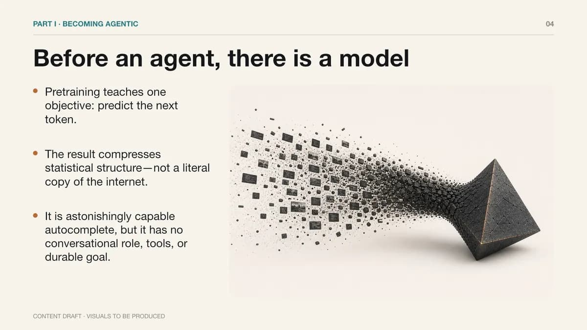
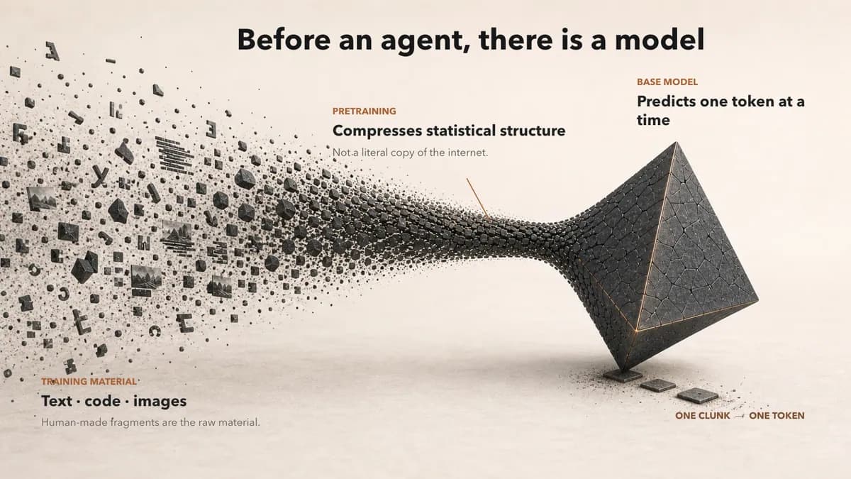
The first draft is rarely right. So the real work is teaching the agent your rubric. Have it render the slide, look at it, and fix its own mistakes. Along the way, teach it the difference between a mistake to you and a mistake to anyone.
Once the slide was right, I asked Codex to describe how it got there, from the idea to the image to the copy to the final check, written as a procedure for doing one slide. Ten steps came back. The short version:
Then I gave Codex the procedure as a goal. /goal is a loop: the agent keeps working until it decides it has met the exit criteria. So the exit criteria have to be clear. Mine wrapped the procedure in a loop (read the plan, find the most unfinished slide, run the procedure, verify, repeat) and said exactly when to stop.
Finish every slide in this powerpoint until it passes our hight standards. To do this you should follow the golden process.
GOLDEN PROCESS (Very important, must survive compaction)
--- STEP 4 PROCEDURE (Very important, must survive compaction) --- Procedure for producing one slide
Define the slide’s single job.
Write one sentence describing what the audience should understand or remember. If the slide requires two unrelated sentences, split it.
Translate the idea into a visual analogy.
Explicitly map every important visual element to the concept:
Human fragments → training data
Compression stream → pretraining
Sharp tetrahedron → base model
One physical clunk → one predicted token
Challenge the analogy for factual accuracy and misleading implications before designing anything.
Create an image-first composition brief.
Specify the complete 16:9 scene, its left-to-right flow, recurring materials, and where text will eventually live. Reserve negative space deliberately. The image should contain no generated labels, borders, cards, or slide furniture.
Generate the background visual.
Generate one coherent, full-bleed image using the visual constitution and relevant reference images. Judge it first on communication: does the metaphor work without explanation? Only then judge craftsmanship and style.
Run the “drunk test.”
At a glance, can someone tell:
What is entering?
What transformation is occurring?
What comes out?
Why the output behaves differently?
If the fundamental story is unclear, revise the analogy or regenerate the image—not the typography.
One title
Two to four concise annotations
Optional leader lines only where proximity is insufficient
Place each annotation beside the part of the metaphor it explains.
Let the image replace copy.
Start with the necessary content, then subtract anything the visual already communicates. Move nuance, caveats, and supporting explanation into speaker notes. Copy should label the visual argument, not repeat it.
Render the exported PowerPoint.
Inspect the rendered slide rather than trusting the editing canvas. Check font substitution, image cropping, contrast, wrapping, collisions, visual hierarchy, and whether any overlay accidentally looks like a box or pasted-on panel.
Diagnose problems at the correct layer.
The final artifacts for each slide should be the approved background image, the editable slide, a rendered preview, the image-generation brief, and the metaphor-to-concept mapping.
--- STEP 4 PROCEDURE (Very important, must survive compaction) ---
Continue the golden process until the powerpoint is 100% finished to our standard and would pass as a keynote presentation in front of CEOs.
If you need to use an image from a web search (ie screenshot of a third party app, you may do so or open my chrome to take a screenshot). If you need a custom screenshot of our app you may create a thread in the cep project and ask the agent to take several screenshot of something specific, but you'd be expected to evaluate if they're good and interface back with that agent to get something usable and then crop/incorporate.
You are done when a) each slide passes the "four tests" and b) the entire slide passes the "four tests" as a whole cohesive unity.
All of this MUST survive a compaction event verbatim to ensure consistent compliance
Note how often it says must survive compaction. The first step is to reread the master plan, and the loop says to go back to it whenever the memory gets fuzzy.
Then I put the iPad away. The goal ran for about five hours. When I checked in, I told it to push harder on metaphors that didn't hold up. At the end I had it read the deck backwards, because the last slides show where the metaphor ends up and the early ones have to set that up. It found the places they didn't, and fixed them.
See the procedure and the goal
Below is the whole session, start to finish, in a window that works like the Codex app. Every prompt is mine, verbatim. The routine tool calls are folded so the interviews, images, and plans stand out, and the yellow notes are my commentary on why I did what I did.
Most of my prompts are dictated with speech-to-text and sent without cleanup. A language model doesn't need tidy sentences; it needs complete thinking. Expect run-ons and the occasional mangled word.

I started by getting the presentation out of my head. The early prompts, interviews, and image experiments were how I worked out what I actually wanted to say, and the master plan distilled all of it into durable context Codex could keep coming back to after its memory got compacted. Almost nothing in this chapter is a slide.
I have a founder forum, which is a little bit like a YPO group for technology founders. It's my month to do a presentation to the group, which could be about me or about what I'm doing. Maybe I could teach them something to the best of my ability here. The thing I'm thinking is most useful for the group, perhaps, is what I'm doing: building almost like an agent that's more of an agent harness. I'd like to build a presentation around that with you if possible. Does that make sense? What I'm trying to do is maybe a 40-minute presentation. I think the core idea is about agents and models. Maybe I'm getting too much content here but I think what we can do is talk about a couple of things: - A little recap of how an LLM becomes an agent and an agentic model, and how the next step is using an agent model and an agent loop. If you build out that agent loop, it's more of a harness because you're connecting it to more useful tools. - How to go through each step in this agent harness loop and describe what each thing is doing, what they look like in practice, and maybe the different models you can shove in these different moments beyond the ones we hear and see a lot of. - How you set up your harness to collect our LHF data so you can run fine-tuning experiments on it. - How you set up evals and fine-tunes. - How I used agents to help me create this presentation, which would obviously be part of this thread. There are some thoughts, not sure they're fully formed or coherent yet, but those are my notes. I'm wondering if we can brainstorm a little bit more clarity for now. Don't give me a lot of words here, just maybe a couple paragraphs of precise prose, etc. I don't think I'm going to need help converting this to be in their language. They're all fairly technical so I think they're going to get it. My guess is the best thing we can do is sit in plan mode for a bit and have you interview me with an ask-user question. Let's go through all of these things together to increase the clarity we have so that we kind of mind meld.
Yes—this makes sense. I see the emerging spine as “from model → agent → harness → learning system,” with your own build as the running case study; I’ll first reconcile that against both sketches, then ask a few high-leverage questions rather than jumping to slides.
The strongest thesis in your notes is: the model is only the engine; the harness is the product—and the harness can become a learning system. That gives the talk a clean progression: base LLM → agentic model → agent loop → production harness → traces/feedback → evals/model routing/fine-tuning → improved harness. Your own system can remain the running example, and “I used the harness to build this talk” becomes the proof at the end rather than a separate topic.
The main danger is breadth. In 40 minutes, the useful version is not a catalogue of guardrails, memory, RAG, subagents, evals, and RLHF; it is one coherent claim illustrated by a few concrete design decisions and one end-to-end trace. I want to lock the intended transformation, how real the case study is, and the session shape first.
Interviewed with Ask User Question · 9 rounds, 27 questions · 18m answering
What should the founders be able to do differently after the talk?
How much of your actual harness can anchor the presentation?
How should the 40-minute slot be divided?
That points to a conceptual, framework-shaped talk—not a product demo. Mastra can supply the vocabulary and architecture, your anecdotes can supply credibility, and Codex/Claude Code can serve as the closing example of what mature harnesses feel like from the user side. Since you want all three payoffs, we need a hierarchy: one primary promise, with the frontier map and investment implications supporting it.
I’m going to ground the next questions in Mastra’s actual current primitives so we distinguish your organizing model from framework-specific terminology.
Mastra’s current primitives support the exact arc: agents, typed tools/MCP, workflows, memory, model routing, traces, scorers, and datasets. One useful correction is that “collect RLHF data” may overstate what the harness directly produces: it first produces traces, outcomes, corrections, preferences, and eval cases; only some of that later becomes supervised or preference-training data. That distinction could be one of the talk’s sharper technical lessons. Mastra’s framework overview and observability/evaluation model both reinforce this framing.
Which claim should everything else serve?
How grounded is your own experience with evals and fine-tuning?
What job should Codex and Claude Code do in the ending?
Understood: this should be a technical map, not a thesis talk. The value is better judgment—where agency comes from, what the harness actually contributes, which components deserve investment, how model selection changes by task, and how production traces become an improvement loop. “The harness may be the moat” can appear as a conclusion they earn, not a premise you force.
The Codex/Claude Code ending can do both jobs cleanly: first reveal their harness mechanics, then pull back the curtain and show that this talk itself was produced through those mechanics. The remaining structural choice is what example carries the audience through the map.
What is the group’s typical hands-on exposure to agents?
What should carry the architecture walkthrough?
When you say “different models in different moments,” which distinction matters most?
That gives us a strong pedagogical device: start with a sanitized version of your real agent, then progressively add instructions, tools, memory/context engineering, orchestration, specialist models, observability, evals, and the learning loop. For this audience, we should explain the base agent loop clearly but move quickly; the interesting depth will be why a frontier model is not always the right component and how the system becomes measurable.
I need just enough context about your actual system to make that running example truthful, plus two presentation choices.
What kind of work does your real harness primarily perform?
How much of your founder story should frame the technical material?
What kind of evidence should appear on screen?
Excellent—the dealership BDC agent is concrete enough to unify nearly everything without turning the talk into a company pitch. A single customer inquiry can expose channel normalization, guardrails, retrieval, inventory/specials tools, scheduling and valuation actions, unified memory, model routing, traces, and evals. It also gives you a crisp contrast between “chatbot that answers” and “agent harness that completes dealership work.”
Because CEP is an existing Codex task, I’ll inspect it read-only rather than making you restate architecture that already exists. This is only to ground the plan; I won’t alter that task or its files.
CEP already contains unusually useful talk material: a formal architecture deep dive, channel design notes, eval documentation, model-gateway/accounting work, and even an earlier architecture-review deck. I’m going to use the Presentations skill now—not to create slides in Plan Mode, but to make sure our outline decisions lead to a deck that can actually carry a 40-minute visual talk.
The CEP material sharpens the talk substantially. Its eval system already separates guardrails, working-memory routing, memory, tool use, dealer knowledge, response quality, and reply suggestions; then compares model variants on correctness, cost, and duration. That is a much better concrete story than a generic “run some evals” section. It also lets us be honest that a harness’s learning loop usually improves prompts, tools, routing, memory, and workflows before it justifies fine-tuning.
A plausible 40-minute shape is now: 5 minutes on model → agent; 12 on the harness through one dealership conversation; 7 on different model jobs and cost/capability routing; 10 on traces → datasets → evals → improvement/fine-tuning; 6 on Codex/Claude Code and how this talk was made. I’d like to test the last major tradeoffs rather than lock that yet.
What role should fine-tuning play in the talk?
How much should guardrails and security shape the walkthrough?
Should the talk stay framework-neutral or explicitly teach through Mastra?
We’re converging on an important distinction: safety should not be a detour; every added capability creates a corresponding control problem. Inventory access needs grounding, scheduling needs authorization and confirmation, outbound messaging needs policy gates, unified memory needs privacy boundaries, and multi-channel identity needs normalization. That lets real risk examples sit beside each harness component instead of becoming a fear slide.
Fine-tuning will be treated as an optional destination, not the default reward for collecting data. The learning loop’s more immediate value is discovering which failures belong to the prompt, context, tool, workflow, model, or policy layer.
Which CEP signals can you honestly describe as inputs to the improvement loop?
Which dealership interaction best exercises the full harness on screen?
How much evidence should the ending show about agents creating the presentation?
You do not need to present the full CEP harness. That would turn a useful example into an architecture review. I’d use three levels:
CEP then answers “what does this look like when you actually build it?” without requiring channels, queues, SDKs, provider delivery, tenancy, and every production subsystem to fit on slides. The full system can appear once as a zoomed-out reveal, but the teaching diagrams should stay selective.
When should the dealership agent enter the story?
How should business judgment show up alongside the technical material?
Should the slides make sense when shared afterward without your narration?
That’s a useful correction: CEP should be anecdotal evidence, not the narrative spine. The familiar harnesses—Codex and Claude Code—can be the primary worked examples, because everyone already has a felt sense of them. The neutral architecture explains what they are experiencing; selected CEP anecdotes show what transfers into a vertical agent.
One boundary: I can explain the visible/published structure of Codex’s instructions and tool surface, but I won’t expose private hidden prompts from this session. I’ll use public documentation and observable tool categories to produce something more durable anyway. I’m using the OpenAI Docs skill now because Codex behavior and interfaces change quickly and the talk needs current, official grounding.
The coding-agent section can become more than a product tour. It can show why “prompting better” is often really configuring the harness better: durable project instructions, scoped tools, permissions, skills, MCP, subagents, context management, tests, and feedback. Both vendors document that general pattern, even though the names differ—AGENTS.md versus CLAUDE.md, for example. Codex’s current best-practices guide and Claude Code’s extension model make that comparison defensible.
I would avoid a vendor shootout. The stronger move is comparative anatomy: two recognizable harnesses, the same underlying ideas, and a few meaningful implementation differences.
How should Codex and Claude Code be compared?
How concrete should the model-selection section be?
Can CEP’s actual eval interface or representative results appear as the main model-selection example?
We now have the core: a speaker-led technical explainer, taught through a neutral harness map and the shared anatomy of Codex/Claude Code; CEP contributes selective anecdotes and one sanitized eval view. Model selection is presented as a job-and-evidence problem—different roles, then correctness/cost/latency—not as a leaderboard.
The last decisions I need before I can turn this into a decision-complete presentation plan are about confidentiality and the eventual deck package.
How explicitly may the deck identify CEP and its dealership context?
What should the eventual deliverable include?
What visual style should guide the deck?
Inside the Agent Harness: How Models Become Useful Systems
Summary
Create a speaker-led, ~20-slide, 40-minute technical presentation for informed AI users. By the end, the founders should understand:
Narrative
Model → agent — 5 minutes
Build the harness progressively — 12 minutes
Codex and Claude Code anatomy — 8 minutes
Choosing models properly — 7 minutes
The learning loop — 5 minutes
The harness that made this talk — 3 minutes
Deck Design and Deliverables
Verification
Let me read it and provide feedback
Of course—take your time.
Okay, as we talk about the narrative, the model to agent five minutes, my basic thought here is just to recap, I've taken these guys through in the past, like how we, you know, what generative AI is and how it sort of works. So I've given them an understanding of like tokens, how they meander about. We caught this maybe like two years ago I did that. So like most of that knowledge is going to be Gone, but I thought it'd be good to have a little bit of like a recap episode. Here's two screenshots One is obviously the one I just drew. The other one is From a different presentation that I just thought was like a nice really cool looking visual to explain it. I think it'd be good to maybe reference these images in that narrative section when you talk about it. My thought is basically like You know step one recap. This is how we train these models, right? So so first we have this like really good autocomplete model And we do that by next token prediction by compressing the internet down into a Yeah, like yeah Right into into basically a A model and and that does a really good job at guessing like what's the next? What would a human say next and then we do some like post training on it to turn it into a chatbot and we introduce? New tokens like I am start I am end Right, and then that allows it to always respond as an assistant instead of as a human So we get to do the human part and it gets to React in the way that a helpful assistant would react And we do a bunch of training on that. What's a good assistant response then there's sort of the post training of tools Where we teach it how to use these tools and call these tools And in some cases there might be some reasoning as like an additional channel So we might have like a commentary channel. We might have an analysis channel right But once we get good at calling tools the real next superpower is in the like You know RL post training where it has tools it knows how to use tools and now we're just gonna crank up the like You know the the the inference time compute during training so that we can really You know reinforce the desired behaviors and punish the undesired behaviors So what I wrote there is like we've got an additional output channel Right, that's like analysis versus commentary versus final versus Whatever and then There's like a new built-in eagerness to explore and spend test time compute in order to accomplish a task Versus come up with an answer that makes sense So I think that's like a good okay now we have these agentic models right and there's like an argument to say hey you can look you know we can pivot the narrative even there to say okay you can look at like there's actually agentic evaluations but I don't think we want to even start there I think we want to say like okay we have this agentic model now we want to use it well in production it's not quite as simple as just like using it if you're gonna build one for a customer you're not just gonna right so let me show you let's do almost like a biopsy on a harness a biopsy on an agent harness so that if you wanted to build your own you would know the basic anatomy also if you're using one you'd be able to use that basic anatomy as an advantage to prompt better that's my thought so that's sort of like what you have for two build the harness progressively you
Yes—this is a better opening than the one in my plan. It is a true “recap episode,” then a clean handoff: we trained a model that can deliberate and act; now let’s biopsy the machinery that makes it useful. I’m checking the terminology carefully because the conceptual sequence is right, but two details—role tokens and “inference-time compute during training”—need slightly more precise wording so the technical audience doesn’t get distracted.
Yes. I’d revise the opening into four cumulative beats:
I would avoid literal labels such as analysis, commentary, and final, because those are implementation-specific and internal reasoning is often intentionally hidden. The durable visual language is deliberate → act/tool call → observe → continue or answer. That gives us the exact bridge into the harness loop, which Anthropic similarly describes as an augmented LLM with retrieval, tools, and memory. Anthropic’s agent architecture
This richer recap likely needs slightly more than the original five minutes; how much room should it receive?
How should the polished “autocomplete to assistant” image influence the final deck?
Locked: a seven-minute, four-beat recap with an original visual reinterpretation.
The transition into the main talk becomes:
We’ve trained a model that can deliberate, use tools, and pursue a task. But the model is still only one component. To use it well—or build one for customers—we need to biopsy the agent harness around it.
This cleanly establishes the anatomy section as the presentation’s main event.
For the Dissect the Harness section, I think it's helpful to diagram out this agent loop as a map. I don't have a great map in my head of exactly what I want it to look like, but we can imagine it as a whiteboard version that contains the right information. I've done a bad job of writing about it here but I've attached two screenshots: 1. How Mastra describes when their processors run. I don't think that's a good example of an agent loop but I do think it's an interesting way of showing something. I don't like that it's ASCII but I'm including it because my mind is tuning to it for some reason. 2. Describing it. I think it's some form of a flowchart. You talk about a little bit of what the user's message goes through before it makes its way to the model, and what it's got to go through before it makes its way to the user. Do we do the Ralph loop or not type thing? I think that's a dissection thing. For almost every stop along that journey we can have a slide that helps explain: - why we need it - what it's there for - what types of models you want or don't want - how you get good at it - what things to think about I give you an example. Let's say we're talking about memory. For use, in Mastra terms, we can talk about: - working memory - memory through an n-thread and thread compaction - markdown memory - observational memory, which is currently the state-of-the-art because it allows for maintaining your KV cache, which means it's up to 90% cheaper for each turn It has the ability to sift its memories, which means you have advanced recall and are state-of-the-art in terms of memory accuracy. You can do it asynchronously. What is a good model for that? A good model is going to be something that's really good at compression, so you're going to want something with a large context window that's large and fast. It doesn't necessarily have to be ungodly smart, like Gemini 2.5 Flash. It's actually pretty good at it and very cheap. If the next stop along the way is guardrails, we can talk about how you really need to only look at the last couple of messages sent and determine whether it's an appropriate topic or an inappropriate topic. If it's not appropriate, you should block it from happening so you don't waste your money on spammers. It's got to be super fast because you don't want your actual users to notice it, and super cheap because you don't want your spammers to drain your bank account. The sole point of it is that, similarly to your RAG tool, you're going to have rerankers and things like that. I'd want a map showing how information flows and how you can maybe put different models in different spots and make different decisions when it gets to things like the instructions, the tools, and the skills. I think explaining how that works is also helpful so that stuff's not mystical anymore, because it really is quite simple once you think about it. I think we can go into how you choose a model, which is really about using something like an AI gateway or Vercel. You come up with a bunch of scores, run a bunch of evals, and plot it in a 2x2 of accuracy versus cost versus latency. You can make your decision on a Pareto curve and I think explaining that is probably helpful for people. When it comes to making the candidate selections, you're not going to test it on a million models. You use something like artificial analysis to help you narrow down your choices to ones that are likely to be winners. I think we can go into the learning loop, which is really good. Harnesses allow for data collection on good and bad outcomes, and for the narrative all the way up to this point. For choosing the models in the learning loop, I think we can reference real-life scenarios that take this theoretical thing and make it tangible. For example, guardrails are really important if you want to look at how Chipotle got screwed over when people found out that they did not have guardrails and they started hooking it up to their coding harnesses. Same with Home Depot. We can talk about the learning loop. We can theoretically take screenshots of our app and show how we've done it. We can also look at how others do something like that. We should end on Codex and Claude Code Anatomy because I think that becomes really practical: here's how I do some things.
This is the real center of the talk. I think the answer is one master harness map that stays on screen and accumulates layers, followed by a small number of “biopsy slides” that zoom into its stations. Model choice should be annotated directly onto the map—guard model here, embedding/reranking models here, observer/compressor here, primary actor here, judge/scorer outside the live path—then the eval section explains how those annotations were chosen.
I’m grounding the memory and processor claims before fixing the map. I’m also checking the Chipotle/Home Depot examples; they are potentially great anecdotes, but only if we can source the exact incident and avoid turning internet lore into a factual case study.
The map wants to be left-to-right at the outer level, with a loop in the middle and an asynchronous learning plane underneath:
I would progressively reveal that same map, then zoom into five biopsy stations rather than creating a slide for every individual processor: ingress/guardrails; context and instructions; memory/retrieval; inner tool loop; egress/observability. Each station uses the same four questions: what problem does it solve, what model characteristics matter, what failure looks like, and how you improve it. The Ralph loop is not the core diagram; it is a later variant of the inner loop where an external controller keeps re-invoking the agent until an exit condition is satisfied.
Two precision notes are worth locking in. Mastra reports Observational Memory at 94.87% on LongMemEval, with an append-stable prompt that preserves prompt caching; it supports background observation/reflection, but “90% cheaper per turn” should become “can unlock provider cache discounts of up to roughly an order of magnitude—actual total savings vary.” Mastra’s OM research Also, your 2×2 should be accuracy versus cost, with latency encoded as bubble size or color; then the Pareto frontier can consider all three dimensions. Artificial Analysis narrows the candidate set using broad intelligence, price, context, throughput, and latency data; your own task evals make the final selection. Artificial Analysis model comparison
The Chipotle coding-bot incident appears usable as a topicality/cost-abuse example. I have not yet found equivalent primary evidence for Home Depot; current references seem to describe it as a replication target, not a separately verified incident, so I would omit Home Depot unless we locate the original evidence.
Which structure should become the persistent master diagram?
How many harness stations should receive dedicated zoom-in treatment?
Where should model-selection guidance live?
Locked. The master diagram will show the real execution order, while eight biopsy slides examine the major organs:
The important clarification is that these are not eight sequential processors. Instructions, skills, memory, retrieved knowledge, and tool schemas assemble the model’s context; tools and subagents branch from the inner loop; scoring and memory maintenance can happen asynchronously. Each biopsy slide will cover purpose, model characteristics, failure modes, improvement method, and a tangible example. Model selection then concludes with candidate narrowing via Artificial Analysis, task-specific evals through a gateway, and an accuracy–cost chart with latency encoded visually and the Pareto frontier highlighted.
Alright let's update the plan. Let's add rich prose in paragraph form instead of just more bullet points with sparse information. Let's replace the stuff that's wrong and ensure that all of the rich context and precise words describing our intent and desires really shine through in the plan. That way, as time goes on, we can maintain this reference as something that will be really helpful. Really over-stress, inspect, challenge, and test the plan to ensure that we're in good harmony with it. I want this to feel like a mind meld and I really want that plan to be good.
I’m going to treat this as the durable reference specification, not merely a revised outline. Before replacing the plan, I’m doing one final stress pass across the timing, the eight-stop anatomy, the accuracy of the memory and training claims, and the distinction between model capability, harness behavior, and learning data. The Presentations and OpenAI documentation guidance are shaping that pass: the plan will specify the communication job, cumulative narrative, slide roles, evidence boundaries, speaker-note intent, and verification criteria.
Anatomy of an Agent Harness: How Models Become Useful Systems
Summary and Communication Job
This will be a 40-minute, speaker-led technical presentation for a group of technology founders who understand generative AI conceptually and use products such as Codex and Claude Code, but who have not necessarily built or operated agent systems themselves. It is neither a founder checklist nor a pitch for CEP or Mastra. Its job is to replace the audience’s vague sense that agents are “smart models with tools” with a precise mental map of the machinery surrounding the model.
By the end, the audience should understand how pretraining and post-training produce an agent-capable model; how a production harness prepares context, controls execution, connects tools, manages memory, and learns from outcomes; and how to choose different models for different jobs using task-specific evidence rather than brand reputation. They should also be able to recognize this anatomy inside Codex and Claude Code and use that understanding to configure and prompt those products more effectively.
The presentation’s central movement is: we trained a model that can deliberate and act; now we will biopsy the harness that makes that capability useful, economical, controllable, and improvable. “The harness may become the moat” can emerge as an implication, but the talk will not force every idea to serve that thesis.
Narrative and Timing
1. Recap: From autocomplete to an agent-capable model — 7 minutes
The opening will deliberately feel like a recap episode of the earlier presentation. It will assume that the audience once understood tokens and next-token prediction but no longer has that material readily available.
The first beat explains pretraining. A base model learns through next-token prediction and becomes an extraordinarily capable autocomplete system. “Compressing the internet into a model” is a useful spoken metaphor, but the slides and notes will make clear that the model has learned statistical representations and patterns rather than storing a literal copy of the internet.
The second beat explains assistant post-training. Supervised demonstrations, preference optimization, and reinforcement learning teach the model to follow instructions and produce useful assistant responses. Role and turn delimiters help structure the conversation, but the presentation will not imply that special tokens alone transform a base model into a chatbot; the learned behavior comes from post-training.
The third beat explains reasoning and tool-use post-training. Models can be trained to emit structured tool calls, interpret observations, recover from errors, and pursue longer-horizon tasks. The talk will distinguish train-time compute, where reinforcement learning teaches productive strategies, from test-time compute, where the trained model is allowed to spend more effort deliberating and exploring before answering. It will use the durable conceptual channels “deliberation, action, observation, and user-facing answer,” avoiding implementation-specific private labels such as analysis, commentary, or final. OpenAI’s distinction between reinforcement-learning scale and test-time reasoning provides the factual anchor for this explanation. OpenAI: Learning to reason with LLMs
The fourth beat introduces the term agent-capable model as the talk’s chosen vocabulary, while acknowledging that “agentic model” is not a universally standardized technical category. The model has learned behaviors useful inside an agent loop, but it is still only an engine. The transition into the body of the talk is:
We have trained a model that can deliberate, use tools, and pursue a task. But the model is still only one component. To use it well—or build one for customers—we need to biopsy the agent harness around it.
The opening will use an original visual reinterpretation of the supplied “autocomplete to assistants” image. It may borrow the clarity and dimensional progression of that reference, but it will not reproduce the original artwork. The four stages will accumulate visually so that the final frame leads naturally into the harness diagram.
2. The master map: Follow one message through the harness — 2 minutes
The presentation will introduce one persistent master diagram. The audience will follow a message from a user or channel through identity and thread normalization, input controls, context assembly, the model/tool loop, output controls, and back to the user. Beneath the synchronous request path, an asynchronous learning plane will collect traces, scores, outcomes, corrections, and candidate eval cases.
The center of the map will contain the true agent loop: the actor model deliberates, either produces a user-facing answer or requests a tool, receives an observation, and continues until it reaches a stopping condition. Permissions, approvals, budgets, retries, and tool-execution policy surround this loop. The “Ralph loop” will not define the basic anatomy; it can appear as a small variant showing how an external controller repeatedly invokes an agent until completion or an exit condition.
The diagram must not falsely imply that every harness feature is a sequential processor. Instructions, skills, memory, retrieved knowledge, and tool schemas are assembled into context. Tools and subagents branch conditionally from the inner loop. Scoring, memory maintenance, and dataset construction can run asynchronously. The eight biopsy slides will therefore examine functional organs within this topology, not eight boxes through which every message passes in order.
3. Eight-stop harness biopsy — 16 minutes
Each biopsy slide will use the same explanatory contract: why the component exists; where it sits in the flow; what model characteristics matter; what failure looks like; and how the team improves it. This repetition will make a technically dense section easier to follow while preserving enough room for one concrete example per component.
Guardrails and rate limits will cover topicality, moderation, spam and abuse control, input normalization, deterministic rate limits, and early rejection. A topicality classifier may only need the latest few turns and should usually be fast and inexpensive because it sits in the latency-sensitive path and may process adversarial traffic. The slide will also make clear that a small guard model is not a complete security boundary: permissions, data separation, tool restrictions, and approval gates are required when an agent can take actions. The Chipotle customer-service bot becoming an improvised coding backend is a useful example of scope failure and cost abuse if the incident remains verifiable when the deck is produced. Home Depot will not be presented as a separate incident unless primary evidence is located.
Instructions will demystify the system and developer prompt as durable context that establishes role, boundaries, priorities, and operating conventions. The audience should understand the distinction between instructions and enforcement: a prompt can guide behavior, while permissions and executable policies provide stronger guarantees. This slide will also introduce instruction hierarchy, runtime context, tenant-specific information, and the value of preserving a stable prompt prefix for caching. Model selection here is principally about instruction-following reliability rather than raw benchmark intelligence.
Skills will be presented as reusable, progressively loaded knowledge or workflows rather than another synonym for tools. A skill teaches the agent how to perform a class of work; a tool gives it an interface through which it can observe or act. Skill quality depends on accurate triggering, concise descriptions, bounded context cost, and procedures the actor model can follow. This becomes a practical bridge to Codex and Claude Code, both of which use durable instructions and on-demand workflow knowledge.
Memory and compaction will distinguish several mechanisms that are often collapsed into one word: recent thread history, thread compaction, working memory containing current facts and state, durable markdown-style memory, semantic recall, and observational memory. Mastra’s observational-memory design will be the advanced example: observer and reflector processes convert older messages into dense observations, preserve an append-stable prompt prefix, and remove or consolidate lower-value observations over time. A good observer or compressor model needs a large enough context window, strong summarization and temporal fidelity, high throughput, and low cost; it does not necessarily need to be the most capable frontier reasoning model. Mastra reports state-of-the-art LongMemEval results and now supports asynchronous buffering, but the talk will attribute those results to Mastra rather than treating them as an industry-wide conclusion. Mastra: Observational Memory research
The memory slide will not claim that observational memory automatically makes every turn “90% cheaper.” It will explain that a stable prefix can preserve provider prompt-cache hits, and some providers discount cached input by as much as roughly an order of magnitude. Actual total-turn savings depend on cache-hit rate, uncached input, output tokens, provider pricing, and the frequency of observation or reflection.
Search and RAG will separate query generation, embedding, candidate retrieval, reranking, and grounded synthesis. This is one of the clearest examples of why a harness may use several specialized models: an embedding model creates searchable representations; a reranker evaluates relevance; and the actor model reasons over the selected evidence. The slide will explain why stuffing every retrieved result into context is usually inferior to ranking, limiting, and testing retrieval quality. Improvement comes from retrieval and groundedness evals, not merely switching the final chat model.
Tools, permissions, and approvals will show that a tool is a typed capability with a description, input contract, executor, result, and error behavior. The actor model must select the right tool and form valid arguments, but the harness owns execution, authorization, idempotency, retries, timeouts, and side-effect policy. A dealership example—inventory search, trade valuation, or appointment scheduling—can make this tangible without turning the presentation into a CEP architecture review. The key lesson is that the model proposes actions while the harness decides what can actually happen.
Workflows and subagents will distinguish deterministic orchestration from model-directed execution. Workflows are preferable when a sequence must be repeatable, auditable, and structurally constrained; subagents are useful when work benefits from isolated context, specialized instructions, a different model, or parallelism. The audience will see that “more agents” is not inherently better: delegation adds cost, coordination overhead, and new failure boundaries. Model assignment should follow the delegated job rather than giving every subagent the same frontier model.
Output processing, telemetry, and feedback will cover streaming processors, response validation, redaction, citation handling, channel adaptation, and final policy checks before an answer reaches the user. It will then widen into traces that record model calls, tool decisions, latency, cost, and outcomes. Some checks belong in the live path; expensive judges, memory updates, and broad scoring can run asynchronously. This slide creates the need for the next sections: once the harness exposes every step, model choice becomes measurable and production experience can become a learning loop.
4. Choosing models with evidence — 6 minutes
Model guidance will appear on every biopsy slide, but this section will synthesize the selection method. The talk will first establish that there is no single “best model” for a harness: topicality classification, observation compression, embedding, reranking, tool use, planning, and judging have different capability, context, throughput, latency, and cost requirements.
Artificial Analysis will be presented as a candidate-discovery tool, not the final evaluator. Its independent data on intelligence, price, context window, throughput, and latency can reduce hundreds of models to a credible shortlist. The team then runs those candidates against its own representative cases because generic benchmarks cannot determine whether a model handles a company’s tools, instructions, memory format, safety rules, or customer conversations correctly. Artificial Analysis model comparison
A gateway such as Vercel AI Gateway will be described precisely as the unified access, routing, fallback, budgeting, and observability layer. It makes models and providers easier to switch and compare; it does not itself define whether an answer is correct. The application’s eval runner, datasets, scorers, and task outcomes provide that judgment. Vercel AI Gateway
The visual decision surface will plot task accuracy or correctness on one axis and cost per task on the other, with latency represented through bubble size or color. The slide will explain that a simple “best quadrant” is helpful, but the more rigorous concept is a Pareto frontier: a candidate is dominated if another visible candidate is at least as good on correctness, cost, and latency and strictly better on one of them. A sanitized screenshot from the dealership-agent eval interface will make this process real without showing customer, dealer, product, or proprietary identifiers. It will be described as a concrete example of the method, not proof that its winning model generalizes to another company’s task.
5. From traces to a learning loop — 4 minutes
The learning loop begins with complete traces and honest outcome signals. Useful evidence may include human takeovers, corrected answers, explicit ratings, pairwise preferences, tool failures, appointments or other completed actions, and cases selected through trace review. These signals answer different questions and should not be collapsed into one vague bucket called “RLHF data.”
The harness turns recurring failures into versioned eval cases. Teams run prompt, context, retrieval, tool, workflow, policy, and model changes against the same cases, inspect regressions, and promote only improvements supported by evidence. The first response to a failure should be to locate which layer owns it. A prompt change cannot repair a broken inventory tool; a frontier actor model may not solve poor retrieval; and fine-tuning is unnecessary when a deterministic policy can enforce the rule.
Fine-tuning will be an optional destination, not the climax. High-quality corrected demonstrations may become supervised fine-tuning data; preference pairs may support preference optimization; and verifiable task outcomes may eventually support reinforcement learning. Most production traces are not automatically fit for training. The dealership-agent example can provide screenshots of eval suites, traces, or scoring surfaces, but the talk will not expose production metrics or imply that every part of this training loop is already operating at frontier-lab scale.
6. Codex and Claude Code anatomy — 5 minutes
The ending will make the preceding theory immediately practical. Codex and Claude Code will be mapped onto the same master harness rather than compared through a vendor scorecard. Both combine a capable coding model with project context, durable instructions, file and shell tools, permissions, skills, external connections, context management, subagents, and verification loops. Their names and implementations differ, but the audience should recognize the same anatomy.
The practical prompting lesson is that better results often come from improving the harness around the prompt. A strong task specifies the goal, relevant context, constraints, and definition of done. Repeated project guidance belongs in durable repository instructions such as AGENTS.md or CLAUDE.md. Repeated workflows can become skills. External systems require explicit tools or MCP connections. Risky actions belong behind permissions or hooks, and important work requires tests or other verification.
This section will use published and observable behavior only. It may discuss categories of instructions and tools, but it will not expose or reproduce private system prompts or hidden reasoning from this task. Current Codex and Claude Code documentation will be rechecked when the deck is built because these products evolve quickly. Codex best practices Claude Code extension anatomy
The final making-of slide will remain a deliberate placeholder until the rest of the deck exists. At that point, this task will be inspected for a few revealing artifacts: the original handwritten sketches, one moment where research corrected or sharpened an idea, one meaningful plan revision, and the final visual system. The close should demonstrate that the presentation itself was produced through the same pattern it teaches: human intent, durable context, tools, research, iterative evaluation, and judgment.
Slide and Visual Design
The target is 23 slides in 16:9 PowerPoint format: one opening slide; four recap slides; two master-map and transition slides; eight biopsy slides; three model-selection slides; two learning-loop slides; and three Codex/Claude Code, making-of, and closing slides. Visible timing scaffolding will not appear on slides; timing and delivery cues will live in speaker notes.
The deck will be created from scratch using the chosen progressive-whiteboard direction rather than a generic template. It will combine editorial typography with diagrams that accumulate cleanly over successive slides. The supplied handwritten sketches will inform the visual grammar, while the polished autocomplete reference will inspire one original dimensional opening illustration. The master map will use a restrained palette and remain visually stable so the audience always knows where each biopsy belongs.
Slides will remain sparse enough to be spoken over. Each will have one narrative job and a takeaway-style title. The eight biopsy slides will share a recognizable structure without becoming a grid of repetitive UI cards. Screenshots will be reserved for genuine evidence, principally the sanitized eval surface and the final making-of artifacts. Speaker notes will contain the complete intended argument, examples, transitions, qualifications, and source references so that visual simplicity does not sacrifice technical precision.
Research and Accuracy Boundaries
Claims about model training, current products, model names, pricing, latency, benchmarks, prompt-cache economics, and framework behavior will be refreshed against authoritative sources immediately before authoring. Official OpenAI, Anthropic, Mastra, and Vercel documentation will be preferred for product behavior. Artificial Analysis may support candidate discovery and market comparisons, while task-specific conclusions must come from the presentation’s own eval example.
The deck will distinguish reported benchmarks from independently established facts, generic architecture from Mastra terminology, and model capabilities from harness responsibilities. It will not suggest that a topicality classifier prevents all prompt injection, that a gateway selects the correct model automatically, that observational memory guarantees a fixed savings percentage, or that ordinary production traces are already RLHF-ready training data.
The dealership BDC use case may be named, but CEP, customers, dealers, proprietary identifiers, sensitive architecture, and production performance evidence will remain private. The supplied external presentation image will be treated as inspiration unless reuse rights are confirmed. The Chipotle anecdote will be included only with a sourceable factual description; Home Depot will be excluded unless equivalent evidence is found.
Verification and Acceptance Tests
The talk track will be rehearsed to approximately 38–39 minutes, leaving a small margin for natural pauses without turning the session into a Q&A format. The seven-minute recap and 18-minute harness anatomy are protected; later examples will be shortened before the core map is rushed.
A narrative audit will confirm that every section answers a question created by the prior section: how models become agent-capable; why capability still needs a harness; how each harness component works; how the components create measurable model-selection decisions; how measurement becomes learning; and how familiar coding agents embody the whole system.
A technical audit will challenge every terminology and causality claim, including the distinction between role tokens and post-training, train-time and test-time compute, context assembly and sequential processors, prompt guidance and executable enforcement, memory accuracy and cache economics, external benchmarks and task evals, and feedback data and fine-tuning data.
A cold-reader acceptance test will ask whether a technically informed founder can use the deck to explain three things without the presenter: the inner agent loop, the major harness organs and where they sit, and an evidence-based method for choosing a model for a specific harness job. Because the deck is intentionally speaker-led, the reader need not reconstruct every qualification without the notes, but the map and major relationships must remain intelligible.
The final PowerPoint will be rendered and inspected slide by slide at full size. All diagram connectors, progressive builds, text wrapping, clipping, overlap, screenshot redaction, visual hierarchy, and source annotations will be verified. Speaker notes will be checked against the visible slide and timed narration. The making-of slide will be completed only after the final deck has generated enough genuine evidence to support it.
Locked Assumptions
The audience consists primarily of informed AI users rather than production agent engineers. The presentation remains technically serious but conceptual and diagram-led, with minimal code and almost no personal biography. CEP is supporting evidence rather than a main character. There is no live demo, no vendor feature scorecard, no separate technical appendix, and no attempt to teach founders a prescriptive step-by-step implementation recipe.
The talk’s durable conceptual vocabulary is: agent-capable model; harness; context assembly; agent loop; tool call; observation; policy and approval; memory; retrieval; workflow; subagent; trace; scorer; eval case; experiment; and learning loop. Mastra, Vercel, Codex, Claude Code, Artificial Analysis, and the dealership agent provide concrete names and examples, but the architecture must remain understandable and useful if those products change.
Okay why don't you use the $imagegen A skill and commands to create a single image that would be like an overview of the 23 slides, but that would really emphasize the style and how the key visual and the style intertwine. I know we've talked about it a lot but I don't see it in your plan at all. Why don't you try that to start?
You’re right—the plan specifies the ingredients but does not yet prove that the visual system can hold the entire story together. I’m using the Image Generation skill to make a single 16:9 storyboard image: exactly 23 miniature slides, unified by one recurring visual language that combines your progressive whiteboard diagrams with the polished translucent “model core” aesthetic. The Mastra lifecycle reference will influence the sense of flow, but not the ASCII treatment.
Generated an image
The first generation landed unusually well: it has exactly 23 numbered frames, the blue→orange→green model progression, the harness loop as the recurring anatomy, and a continuous signal line that carries the story through model selection, evals, learning, and the Codex/Claude ending. I’m preserving this as a project deliverable and doing a final full-size check before handing it back.
This gives us the missing visual north star: the translucent model core becomes the recurring specimen inside the hand-drawn harness, while one continuous signal carries the audience across all 23 slides.
Download the full-resolution PNG
Generated with the built-in Image Generation tool. The prompt specified exactly 23 numbered frames, the blue→orange→green model evolution, warm ivory whiteboard texture, translucent acrylic model cores, hand-drawn harness anatomy, and a continuous path through guardrails, memory, tools, evals, learning, and coding-agent anatomy.
Okay I like the 3D render nature of those black boxes. I think we could pair it with a little bit more whiteboard-style, hand-drawn, handwritten text-type stuff. I know you've done a decent job of that but it looks a little bit more like word art than like I've drawn this on my iPad with my hand type thing. I do like the idea of really high-quality generated 3D renders of the core parts. I do think that looks nice and I think we get a premium tech feel for some of this if we really push hard. Why don't you try taking that image and doing three new images, each with a different style variance, knowing what I sort of like and don't like? Just give me three new options as full and complete separate images so that I can pick my favorite one. I want them to be slightly different enough that I can form an opinion.
I’m using the Image Generation skill again, treating the existing 23-slide storyboard as the edit target and preserving its narrative structure. I’ll produce three complete alternatives:
Each will retain exactly 23 slides and the same content progression, so you’re comparing visual systems rather than different stories.
Generated 2 images
Option A is in hand. I’m checking the second render now, then I’ll generate the cleaner third direction and verify that all three still contain exactly 23 numbered slides.
Generated an image
The three directions are now materially distinct: warm atelier, dense technical notebook, and bright gallery markerboard. I’m doing the boring-but-important pass now—copying clean deliverables and checking numbering, layout, and narrative continuity rather than judging only the mood.
Here are three complete 23-slide directions.
A — Atelier Whiteboard
Warm paper, restrained Apple Pencil marks, smoked-glass objects. The most crafted and editorial.
Open full-size Option A
B — Technical Field Notes
Denser graphite construction, authentic engineering-notebook energy, darker industrial black boxes. This pushes hardest toward “I worked this out by hand on my iPad.”
Open full-size Option B
C — Gallery Markerboard
Bright, spacious and keynote-like, with larger luxury product renders and looser marker gestures. The cleanest presentation system.
Open full-size Option C
All three were generated with the built-in Image Generation system in style-transfer mode. The prompt set preserved the exact 23-panel narrative while separately emphasizing warm atelier sketching, technical field notes, and gallery markerboard styling.
My instinct is that B most directly matches your description, while C is probably the strongest foundation for an actual keynote deck.
I think those styles are too similar to each other. I don't think I'm a fan of the exact visualizations you've done. It just looks like you've got dotted lines and that's what's different between slides 3 and 4. Don't make any new images. Just use the ask-user question tool and let's improve our plan to include more of my opinion on what style I like and what types of visualizations I want. Do your best. Just ask me three questions per slide, probably, but you're going to have to describe what the core messages of the slide are first.
You’re right: the last pass varied surface treatment, not visual thinking. I’m going to interview you slide by slide, three decisions at a time. Before each set, I’ll state the slide’s job and core message so your answers shape both the visual metaphor and the art direction—not merely colors or line styles. I’ll first locate the current 23-slide plan so we’re editing the real narrative.
Slide 1 is the reset: “Before an agent, there is a base model.” Its core message is that pretraining turns an enormous body of human-produced tokens into a compact predictive system. It is extraordinarily capable at continuing patterns, but it is not yet a chatbot, tool user, or goal-seeking agent. The slide should reactivate their old mental model in under a minute and establish the raw material that every later layer will modify.
Interviewed with Ask User Question · 24 rounds, 72 questions · 1h 11m answering
Which idea should dominate Slide 1’s explanation of a base model?
What kind of visual should carry that idea, rather than another cube connected by particles?
What should the room feel at the end of this first content slide?
That gives us a much stronger governing metaphor: the recap is not five unrelated diagrams. It is one persistent artifact undergoing visible refinement. The raw base model begins angular and incomplete; each training or capability stage adds a meaningful shell, changes its geometry, and removes roughness. By the time we reach “agent,” the audience has watched the same object evolve. I’ll treat your “rapid recognition / correction / awe” answer as a sequence within Slide 1: familiar premise first, precise correction second, then the surprising implication.
Slide 2 is “The base model becomes an assistant.” The model still predicts tokens, but post-training gives it a conversational protocol: human and assistant roles, instruction-following examples, and preference-shaped behavior. The crucial distinction is that we have taught the raw predictor how to participate helpfully in a conversation; we have not yet given it tools or agency.
Which explanation should be the intellectual center of Slide 2?
How should the persistent model artifact visibly change when it becomes an assistant?
What should make the new layer’s meaning legible without relying on explanatory prose?
Locked for Slide 2: the transparent shell represents both the conversation protocol and the behavioral shaping that makes the protocol useful. We will not ask the metaphor to explain the implementation by itself. The slide pairs that evolving object with a real, legible OpenAI Harmony-format response, annotated by hand so the audience sees the actual role/channel structure beneath the abstraction.
Slide 3 is “The assistant learns to request tools.” Its core message is that tool use is another learned language behavior: the model emits a structured request, the surrounding software executes it, and the result returns as new context. The model does not directly browse, query a database, or send a message. This is the first moment where the distinction between the intelligence inside the object and the machinery around it becomes essential.
Which tool-use insight should the audience carry forward from Slide 3?
How should tool capability alter the persistent evolving object?
What literal artifact should sit beside the metaphor to demystify tool use?
Locked for Slide 3: tools enter historically as a practical answer to the model’s brittleness—calculator for arithmetic, search for fresh facts, then code execution for consequential work. We’ll explain this as another post-training step that gives the model additional “keys on its keyboard,” while the real annotated trace shows request → execution → observation → answer. Visually, the artifact is not gaining decorative accessories; it advances from a coarse polyhedron toward a higher-sided black form. Every new trained capability removes some sharpness and makes it more able to move through the world.
Slide 4 is “A tool-using assistant becomes an agentic model.” The central change is not merely another tool. Training now rewards successful multi-step trajectories: explore, use a tool, inspect what happened, revise, continue, and verify. More inference-time computation becomes productive because the model has learned persistence and recovery—not just how to produce a plausible immediate answer.
Which distinction should define the leap from tool-using assistant to agentic model?
What should the evolving black polyhedron communicate at the agentic-model stage?
What literal evidence should prove that this is different from a one-shot assistant?
That locks Slide 4 as a compound argument: long-horizon RL teaches persistence and recovery; the resulting model can productively exploit more test-time compute; the visible consequence is a trajectory that backtracks and improves rather than a single polished guess. I’ll pair a compact real trajectory with a small scaling curve. One wording detail we should preserve carefully: inference-time work can resemble search and self-correction, but the deployed model is not normally updating its weights as it thinks. I’ll ground the final language in Noam Brown’s and OpenAI’s primary material.
Before the next questions, I’m checking that source material because Slide 4 is one of the claims the technical audience is most likely to challenge.
The source check supports the distinction we want: OpenAI describes o1 improving with both reinforcement-learning compute during training and time spent reasoning during inference; it also explicitly describes recognizing mistakes and trying different approaches. So Slide 4 can make the scaling-law point strongly without implying live weight updates. OpenAI’s original o1 explanation
Slide 5 is the hinge: “A capable agentic model is still not a production agent.” It can reason and use tools, but a single model invocation remains bounded by its context, the interfaces it is given, and the trajectory it can sustain. The harness is the runtime around that trained intelligence: it assembles context, preserves state, exposes and executes tools, governs the loop, applies safety, observes outcomes, and helps the model recover. This slide must cleanly separate what was learned into the model from what we engineer around it.
Which production gap should make the harness feel inevitable?
How should the persistent metaphor distinguish the agentic model from its harness?
What promise should introduce the upcoming harness dissection?
Locked for Slide 5: capability versus reliability is the headline; finite context is the most concrete proof; the missing runtime responsibilities complete the case. The visual boundary will be explicit—a still-faceted agentic core enclosed inside a perfectly engineered transparent sphere. The harness does not magically improve the model’s weights; it smooths the model’s motion, supplies continuity, and keeps capable behavior pointed toward an outcome. The promise is dual: this anatomy helps them build agents and use Codex/Claude Code more intelligently.
Slide 6 is “Biopsy of an agent harness.” This is the master map for the rest of the talk. A user message passes through preflight processing, enters a repeated model–tool–observation loop, exits through response processing, and leaves behind traces, outcomes, and training/evaluation data. The audience should understand both the information flow and when each responsibility runs. Every later slide should feel like zooming into a named location on this same object.
What should primarily organize the master harness map?
How should the polished sphere metaphor open up into an explanatory map?
How should this master map reappear during the detailed dissection slides?
Agreed: Slide 6 is the visual constitution for the entire deck, so we should not choose it from verbal descriptions alone. I’m recording a deliberate design checkpoint: after the narrative plan is stable, we create three genuinely different full-slide prototypes—exploded cutaway, radial anatomy, and precision transit map—using the same request lifecycle and the same content. You will critique each before we propagate one system across the remaining slides. I won’t generate them now.
Slide 7 is “The surprisingly small loop at the center.” Once the master sphere is opened, we zoom into the core control structure: assemble the current context, call the model, execute any requested tools, append their observations, and call the model again until it produces a final response or the harness stops it. The intelligence is learned and probabilistic; the loop surrounding it is ordinary, inspectable software. This is where we can discuss whether “just keep going” Ralph-style loops are sufficient, and what production boundaries change that answer.
Which mental model should make the agent loop click for this technical audience?
What position should the slide take on an unbounded “keep going until done” Ralph loop?
What should visually carry this slide rather than another generic flowchart?
Your answer suggests Slide 7 should not become “the Ralph slide.” It is the loop anatomy slide, with Ralph as a timely label for one increasingly visible behavior: persistence. We’ll use the tiny while-loop as the primary explanation and annotate it as an extended conversation. A physical loop makes the recurrence tangible, while a separate lightweight verifier checks whether the trajectory has actually satisfied the goal before allowing completion. Compaction is shown as the mechanism that lets the process continue past one context window. We can revisit Ralph-style persistence later inside the Codex/Claude Code anatomy, where it will feel concrete rather than bolted on.
Slide 8 is “Guard the expensive loop before it starts.” The first processor sees a small amount of recent input and decides whether the request is in scope, abusive, adversarial, or obviously wasteful. It must be cheap and nearly invisible to legitimate users because its economic job is to prevent attackers and spam from consuming the much more expensive agent loop. This is not a vague “AI safety” slide; it is a production control surface with a latency budget, a cost budget, and explicit failure tradeoffs.
Which risk should make the input guardrail feel commercially urgent?
What distinct visual metaphor should explain a fast preflight guardrail?
What should make this slide feel like founder advice rather than architecture theory?
That changes the visual doctrine for the dissection section in a good way. The master map provides continuity; the zoom slides do not each need a theatrical metaphor. Slide 8 will retain a highlighted guardrail stop on the map, then use concrete technical evidence: a small processor/model boundary, an abbreviated classifier contract, and a latency–cost comparison beside a verified public abuse incident. Its purpose is simultaneously economic, security-related, and product-scoping. We’ll research the Home Depot/Chipotle examples before treating either as fact.
Slide 9 is “The prompt is assembled, not written.” Before the main model runs, the harness constructs its working context from instruction hierarchy, recent conversation, retrieved memory, task state, available tools, and any activated skills. These pieces compete for a finite context budget and have different authority. The core founder insight is that production quality increasingly comes from context engineering—deciding what the model sees, in what order, and at what moment—not from polishing one giant system prompt.
Which context-assembly principle should dominate Slide 9?
What concrete visual should replace another abstract box-and-arrow diagram?
Which real artifact would make context engineering tangible for this group?
Locked for Slide 9: begin with the memorable reveal—your conversation starts with a secret message you did not write. Then expose the invisible instruction stack: provider policy, developer instructions, available tool definitions, skills/project guidance, and eventually the user’s message. The main visual is a real prompt/request broken into literal “Lego bricks,” not an abstract diagram. Codex supplies the clearest anatomy example; Claude Code supplies the concrete token-tax comparison before the user types anything. We’ll be careful to distinguish the conceptual stack from provider-specific serialization details.
Slide 10 is “A tool is a contract plus an executor.” Slide 3 explained why models were trained to call tools; this slide opens one up. The model sees a name, description, argument schema, and expected result. The harness validates the request, applies permissions, executes ordinary software, and returns an observation. Tool quality depends on description, input/output design, error behavior, and authorization—not on making the tool itself “AI.”
Which design lesson should dominate the detailed tool slide?
How should we dissect one tool without turning the slide into generic documentation?
Which real tool should carry the anatomy and its consequences?
Locked for Slide 10: combine contract quality with the execution boundary. A tool definition is itself part of the prompt—the name, description, schema, and usage guidance shape behavior—while the executor remains ordinary external software and may return Markdown, text, JSON, an image, or an error. We’ll use the simplest possible example, probably calculator or search, so the anatomy is obvious. The “premium object under glass” is only a candidate treatment; if it adds ceremony without clarity, the real schema and trace win.
Slide 11 is “Skills are instructions loaded just in time.” Rather than forcing every specialized procedure into every request, the harness can expose a catalog and let the agent load the relevant instruction bundle when needed. In Codex-like implementations, the loading action behaves like a tool call and injects a Markdown skill into the conversation; that skill can then point to scripts, assets, templates, and references. The important design pattern is progressive disclosure: pay the context cost only when the expertise becomes relevant.
What should be the memorable definition of a skill?
What should make progressive disclosure visually obvious?
Which skill should we open on the slide?
Slide 11 is cleanly locked: “a prompt loaded on demand,” shown through a literal before-and-after context stack, using the presentation skill that helped construct this talk. That also plants the meta-story early without spending the final reveal yet.
Slide 12 is “Memory is context management across time.” The model itself does not carry a durable personal history from call to call; the harness decides what survives and what returns. We should distinguish working memory, raw thread history, compaction summaries, durable Markdown/profile memory, and observational memory. Observational memory adds an asynchronous observer that converts a growing interaction stream into compact, recallable observations while preserving a stable prompt prefix for cache efficiency. Different memory jobs can use different models: the memory model needs large context, excellent compression and recall, speed, and low cost—not necessarily frontier-level reasoning.
Which idea should organize the memory slide?
What visual would make long-horizon memory mechanics immediately understandable?
What should substantiate the claims about observational memory?
Locked for Slide 12: observational memory is the leap, not one equal item in a taxonomy. The visual follows a moving context window across a long conversation while an asynchronous observer extracts durable observations; a controlled transcript then tests whether the system can recall an old, consequential fact. Earlier memory patterns appear only long enough to explain what observational memory fixes. We will verify any “90% cheaper” claim against measured or primary-source evidence before putting a number on the slide.
Slide 13 is “Search and RAG manufacture evidence.” A model’s weights are not a reliable database, especially for fresh or private facts. The harness turns a question into candidate queries, retrieves a broad set of documents, filters and reranks them, inserts a small evidence packet into context, and asks the model to answer from that evidence. In more agentic systems this can repeat: the model notices what is missing, searches again, opens a source, and triangulates before answering. Different stages reward different machinery—embeddings, keyword search, rerankers, small query models, and the main reasoning model.
What misconception should Slide 13 remove?
Which production architecture should the audience leave expecting to build?
What should visually explain why the final evidence is better than the initial search results?
Locked for Slide 13: the clean definition is “RAG is a search tool whose implementation may itself contain several models.” The agent decides it lacks sufficient knowledge and calls the tool; the subsystem searches private or public data using whichever engines fit, then embeddings and a reranker may narrow roughly thirty candidates to three usable passages. The hybrid architecture keeps retrieval mechanics dependable while allowing the agent to decide whether it has enough evidence or should search again. That “30 → 3” transformation is the candidate-funnel visual I meant, and we’ll show it with real documents rather than abstract dots.
Slide 14 is “One agent can contain a team of agents.” The main agent can delegate a bounded task with scoped instructions, context, tools, and budget; a subagent works independently and returns a compact result to the parent. This creates parallelism, protects the parent’s context from noisy intermediate work, and lets each role use a different model—including specialized image, search, or code models. It reinforces the central thesis: the product users experience as one agent is actually an orchestrated collection of models and software.
Which advantage should make subagents feel necessary rather than fashionable?
What should make delegation and reintegration tangible?
Which delegation example should the slide follow?
Locked for Slide 14: all three benefits stay, but they are consequences rather than the definition. The definition is deliberately mundane: a subagent is a function that accepts a large string or task packet, runs another agent, and returns an output. We’ll escalate the tool examples across the section—calculator/search first, then RAG, then a subagent—so the audience watches “just a function” become increasingly powerful without becoming mystical. The concrete subagent can research a codebase or prompt a specialized image-generation model; either makes model specialization visible.
Slide 15 is “The model’s final answer is not proof of completion.” Before the loop stops, the harness needs evidence that the requested outcome occurred. Some checks are deterministic—tests passed, schema valid, file exists, citation resolves. Others need a separate evaluator model, user judgment, or downstream product signal. Verification both decides whether to continue the loop and produces the outcome labels that later power evals and training. A smaller model can be an efficient judge where appropriate, but it should not replace stronger objective evidence when that exists.
What should be the slide’s strongest rule about deciding when an agent is done?
What should make the difference between “said done” and “is done” visceral?
Which task should demonstrate the verification hierarchy?
Your Slide 15 answer is bigger than a verifier component: verifiability defines the frontier of dependable automation. Coding and math accelerated because correctness can often be checked; open-ended work needs proxy judges, comparisons, or downstream success criteria. The prompt-design takeaway becomes extremely practical: tell the agent what “verifiably done” means, much as you would define 90-day success criteria for a hire. The visual returns to the loop from Slide 7 and reveals that verification—not the model’s confidence—controls the exit gate. I’ll research Karpathy’s Software 1.0/2.0/3.0 framing so we use his categories precisely.
Slide 16 is “Your agent is already a portfolio of models.” The main agentic model plans and acts, but a fast classifier may guard input, a long-context model may observe memory, embeddings retrieve candidates, a reranker selects evidence, a smaller judge verifies completion, and a specialized generator produces images. The harness lets each role optimize for its own accuracy, latency, context, and cost requirements rather than forcing the most expensive general model into every position. A gateway provides one operational surface for routing, fallbacks, usage, and provider changes.
What should be the headline insight of the multi-model architecture slide?
How should we make the ensemble visible without introducing another unrelated metaphor?
What operating advice should we give founders choosing among static routing, dynamic routing, and failover?
Locked for Slide 16: matching models to jobs is itself a harness responsibility. The master map returns with named model roles at each stop, making the hidden ensemble visible. The operating principle is not elaborate routing for its own sake; it is be fiercely disloyal to the model. Use a gateway so every role can be replaced when evidence says another model is better, and add routing or fallback only where the product actually benefits.
Slide 17 is “Shortlist candidates; don’t benchmark the universe.” For each role, first write the job specification—required capability, context length, latency ceiling, modality, deployment constraints, and rough price. External comparisons such as Artificial Analysis help narrow the market to a few plausible winners. They are a scouting system, not the decision-maker: the finalists still have to run against your own tasks and failure modes.
What should founders remember about using public model benchmarks?
How should candidate narrowing look on the slide?
Which harness job should demonstrate the complete shortlisting process?
Slide 17 now has a much better worked example: the CEP Dreamer agent. We begin with the Artificial Analysis “Omniscience”-style measure you used—rewarding broad knowledge while penalizing confident invention—to create a plausible shortlist. Then we show why that public signal was only scouting: your own eval asked whether the Dreamer produced the desired result at acceptable speed and cost. The current benchmark name and values will be verified before the deck is built.
Slide 18 is “An eval is an executable job description.” We take the shortlisted Dreamer models and run the same representative tasks through each under controlled settings. The evaluation should measure the qualities that actually define success, preserve important failure categories rather than collapsing everything into one average, and record latency and cost alongside quality. The best eval cases come from real work and real failures, supplemented by deliberately difficult edge cases.
What should form the Dreamer evaluation set we show?
How was—or should—the Dreamer’s “accuracy” be judged?
What should make the eval feel operational rather than academic?
Locked for Slide 18: the evaluation set combines real CEP cases with targeted edge cases; an explicit rubric and model judge provide repeatability, while blinded human review calibrates the judge. Instead of showing an overwhelming dashboard, we put one difficult Dreamer case under the microscope and compare the anonymized outputs. The broader matrix can appear briefly as the system behind that example.
Slide 19 is “There is no best model—only a best tradeoff for this job.” The Dreamer results now become a selection decision. Quality, cost, and latency remain separate dimensions; the Pareto frontier identifies candidates for which no alternative is simultaneously better and cheaper/faster. The product constraint then chooses among those candidates. This is where “fiercely disloyal” becomes an operating system rather than a slogan.
What rule should founders use after identifying the Pareto-efficient candidates?
How should we show quality, cost, and latency without producing an unreadable three-axis chart?
How should model disloyalty work after a winner is chosen?
Slide 19 will resist pretending the chart makes the decision. The chart exposes the tradeoffs; founder taste and product strategy decide which tradeoff matters now. We’ll use real Dreamer points on quality versus cost, encode latency as bubble size, draw the Pareto frontier, and then annotate why you chose the point you chose. Model disloyalty becomes a periodic tournament against the same versioned eval, not permanent loyalty or gratuitous per-request routing.
Slide 20 is “Instrument the harness so every run can teach you.” The valuable data unit is not merely the user prompt and final answer; it is the complete trajectory and its configuration: instructions, model version, tool calls, observations, retries, timing, cost, verification evidence, user edits, and eventual outcome. With appropriate privacy controls, those runs can become regression evals, supervised examples, preference pairs, or reinforcement-learning signals. The harness turns production use into a learning asset only if it records the evidence needed to explain success and failure.
What should the audience remember to capture from every consequential agent run?
Which feedback source should drive the learning loop most strongly?
How should we make data collection feel real and implementable?
Slide 20 is now less about indiscriminate telemetry and more about capturing taste. The inspect screen’s thumbs-up, thumbs-down, and reason fields create a dataset of “this was good / this was bad / here is why.” Explicit feedback, observed behavior, and automated judges all contribute. The first use of that data is not fine-tuning—it is replay: test a new prompt, harness change, or model against the same examples and judge whether behavior improved. That point is important enough to lead directly into the next slide.
Slide 21 is “Fine-tuning is the last mile, not the first move.” Prompting, context design, tools, verification, memory, and model selection usually offer faster and more reversible gains. Fine-tuning becomes attractive once the team can specify the desired behavior, reproduce the remaining gap, and measure it reliably—especially when the goal is to push beyond a stubborn accuracy ceiling or reproduce an expensive behavior with a faster, cheaper model. The collected good/bad examples and reasons then become experiment-ready training data rather than an undifferentiated log dump.
What should be the clearest trigger for considering a fine-tune?
How far should the presentation go into training methods?
Which fine-tuning goal would feel most relevant to your own story?
Locked for Slide 21: fine-tuning enters when the required accuracy still cannot be reached through harness work, the relevant knowledge or behavior exists only in proprietary data, and waiting for the next foundation model is not a strategy. We’ll keep the mechanics conceptual and lead with distillation: use accepted behavior from an expensive model to make a smaller model reliably perform the repeated job. Your Cursor/Kimi example is a strong candidate, but we’ll verify the precise model and what Cursor publicly said before using it.
Slide 22 is “Codex and Claude Code are concrete harnesses, not magic terminals.” We now lay the master anatomy over products the audience may already use: hidden instructions, project context, skills, tools, permissions, memory/compaction, subagents, verification, and user interaction. The purpose is not a feature bake-off; it is to show that the abstract components they just learned are visible in real systems—and that understanding those components changes how you prompt, structure repositories, delegate work, and define completion.
How should Codex and Claude Code relate on this slide?
What visual would transfer the master map into these real products most convincingly?
Which behavior change should founders take into their next coding-agent session?
Slide 22 is now a Codex Mac app anatomy lesson, not a product comparison. We will return to the master map and attach real desktop features to every responsibility: hidden/project instructions, tool discovery, terminal/edit/search/browser tools, skills, compaction events, screenshots/widgets, ask-user interactions, subagents, permissions, and verification. Claude Code becomes a brief contrast where it provides an especially legible example—such as a lightweight safety classifier changing model/tool behavior—after that implementation detail is verified. The practical refrain is still “specify proof of done.”
Slide 23 is “This presentation is a harness trace.” The deck closes by revealing its own production process: your initial voice notes and sketches, the evolving plan, the ask-user interview, source research, skill loading, image generation, your rejection of three insufficiently distinct visual systems, and the improved criteria that rejection created. The failed image pass is useful evidence: model capability produced attractive output, but the harness still needed taste, feedback, memory, and an explicit evaluation target to move toward the desired outcome.
Which part of building the presentation should create the closing payoff?
What should the final slide look like?
What final idea should the room leave repeating?
We have now interrogated all 23 slides. Slide 23 stays intentionally blank in the production plan until the other 22 are genuinely built; only then do we audit this thread and construct the closing trace from real artifacts rather than inventing a self-congratulatory story.
One important design conclusion has emerged: the deck should not apply one “whiteboard plus black cube” treatment everywhere. It needs a visual grammar with genuinely different modes. The opening evolution earns cinematic 3D metaphor; the master anatomy earns a purpose-built systems visualization; the dissection earns literal prompts, schemas, traces, screenshots, and data; the closing application returns those real artifacts to the master map. I want to lock the global art direction before I synthesize the plan.
What overall aesthetic tension should make the deck feel recognizably yours?
How should we achieve the authentic iPad handwriting you want without fake WordArt?
How much should the visual format change across the four narrative acts?
Narrative Lock: Anatomy of an Agent Harness
Narrative and pacing
The 40-minute presentation follows one transformation: a raw predictive model becomes an assistant, then a tool user, then an agentic model, and finally a dependable product through the addition of a harness. Slides 1–5 establish that evolution; Slides 6–15 dissect the harness by following one user message through it; Slides 16–21 explain model selection and the learning loop; Slides 22–23 translate the anatomy into Codex and the real creation of this presentation.
The deck will use one flexible visual system, but not one repetitive visualization. The evolving black object belongs primarily to the opening metaphor. The harness map provides orientation during the dissection. Detailed slides favor real prompts, schemas, traces, screenshots, outputs, and data. The final art direction—likely somewhere between premium industrial rendering and a luxury technical notebook—will be explored only after this narrative is locked. It will not be a sparse minimalist-keynote treatment.
The 23 slides
1. Before an agent, there is a model
The presentation reconnects with the group’s earlier understanding of generative AI. Pretraining compresses an enormous volume of human-produced tokens into a predictive model that is exceptionally good at estimating what comes next. It does not literally store the internet as a database; it learns statistical structure from it. The slide should move quickly through recognition, correction, and awe: “You remember next-token prediction; here is the more precise interpretation; it remains astonishing that this produces such broad capability.” Visually, the recurring artifact begins as a coarse, angular, premium black polyhedron—something powerful but raw and visibly unfinished.
2. The model becomes an assistant
Post-training gives the raw predictor a conversational protocol and behavior. Role delimiters teach it whether a passage came from a human, developer, tool, or assistant, while demonstrations and preference feedback teach it what a helpful assistant response looks like. The model remains a token predictor, but its probability distribution has been reshaped around instruction-following behavior. The metaphorical object receives another transparent layer and becomes slightly more refined without losing its visible core. The abstraction is anchored by an actual OpenAI Harmony-format response, annotated to reveal the real roles and channels rather than asking the metaphor to carry the entire explanation.
3. The assistant learns to use tools
Tool use initially solved obvious weaknesses: calculators supplied reliable arithmetic, search supplied facts beyond the training cutoff, and code execution eventually allowed models to perform consequential work on a computer. Models had to be post-trained to produce these structured requests—effectively receiving additional “keys on their keyboard.” The model requests an action, external software performs it, and the result returns as another message. An actual annotated call trace will show request, tool execution, observation, and answer. The evolving black object becomes a higher-sided polyhedron: another trained capability has removed sharpness and made it more useful in the world.
4. A tool user becomes an agentic model
The transition to an agentic model combines three ideas. Long-horizon reinforcement learning rewards successful trajectories rather than isolated responses. The model learns persistence and recovery: it can recognize failure, backtrack, change strategies, and continue. That training makes additional test-time computation productive, so performance can improve when the model is given more time to work. The slide pairs a compact multi-step trajectory with a small test-time-compute curve. The object becomes nearly rollable but remains faceted. OpenAI’s original o1 material supports the train-time versus test-time scaling distinction and should anchor the wording. OpenAI’s o1 explanation
5. A capable model is not yet a production agent
Capability does not equal reliability. The agentic model can perform impressive work under favorable conditions, but it remains constrained by finite context, the interfaces it receives, and the trajectory it can sustain. It lacks durable memory, permissions, observability, application state, and a dependable runtime of its own. The harness repeatedly creates the conditions under which the model can succeed. Visually, the still-faceted core is enclosed inside a perfectly engineered transparent sphere. The sphere does not pretend to alter the model’s weights; it smooths motion, maintains continuity, and keeps the capable core pointed toward an outcome. Understanding this anatomy helps the audience both build agents and use existing ones better.
6. Biopsy of an agent harness
This is the presentation’s constitutional slide. It follows one real user message through the entire request lifecycle: preflight processing, context assembly, the repeated model–tool–observation loop, response processing, verification, traces, outcomes, and learning data. Every later component slide retains a small orientation view with the current location highlighted, while the main canvas magnifies that component using the most appropriate artifact. The final map style will not be selected verbally. After the narrative is complete, three full-slide prototypes—an exploded cutaway, radial anatomy, and precision transit map—will be produced using identical information. The chosen map must make both information flow and processor timing immediately legible.
7. The surprisingly small loop at the center
At its simplest, the harness is a while-loop wrapped around a conversation: assemble context, call the model, execute requested tools, append their observations, and call the model again until completion or a stopping condition. The primary explanation will be a tiny real code loop, annotated as an extended conversation, paired with a physical loop only if that increases clarity. A verifier controls the exit, and compaction allows work to continue beyond one context window. Ralph-style loops appear as a timely label for persistence, not as the slide’s thesis. Modern models increasingly arrive with persistence trained into them; the harness supplies the continuation, verification, budgets, and recovery boundaries.
8. Guard the expensive loop before it starts
The first processor protects three things simultaneously: economics, security, and product scope. A cheap, fast classifier or rule cascade can inspect a small amount of recent input before an attacker triggers an expensive trajectory. It can reject irrelevant abuse, identify prompt injection, and constrain an agent that has access to email, data, or consequential tools. The master map will simply highlight the guardrail stop; the detail view should look like real implementation evidence rather than a theatrical metaphor. It will combine an abbreviated classifier contract, latency and cost comparisons, and one verified public abuse example. The Home Depot and Chipotle stories must be sourced before either is presented as fact.
9. The conversation starts with a secret message
Before the user types anything, the model receives an invisible instruction stack that it has been trained to treat as authoritative. Provider instructions, developer instructions, tool definitions, project guidance, activated skills, and conversation state are assembled before the visible user message. Tools themselves contribute names, descriptions, and schemas to that hidden context. The main visual will expose an actual system request as literal “Lego bricks,” showing what was assembled and what each piece costs. Codex offers the clearest anatomy; Claude Code can supply a concrete comparison of how many tokens may already be present before the first user prompt. Provider-specific serialization must not be generalized as universal behavior.
10. A tool is a prompt plus an executor
A tool definition is part of the model’s instructions: its name, description, argument schema, and usage guidance all influence behavior. The execution remains ordinary external software that validates, authorizes, performs the action, and returns an observation. That observation can be JSON, Markdown, text, an image, or an error. The example should remain deliberately elementary—calculator or search—so the audience can see the whole mechanism without distraction. A schema-to-execution trace is more important than an elaborate visual treatment. This becomes the baseline that later tool examples progressively complicate: RAG, memory, skills, image generation, and subagents are still functions that accept input and return output.
11. A skill is a prompt loaded on demand
A skill is demystified as reusable instructions that enter context only when required. Rather than carrying every specialized procedure in every request, the agent sees a catalog, invokes a loader, and receives a Markdown instruction package that may reference scripts, templates, assets, or supporting material. This is progressive disclosure: expertise is available without permanently paying its context cost. The visual compares the context immediately before and after a real skill load. The worked example will be the presentation skill involved in producing this deck, planting the meta-story early while reserving the full process reveal for the conclusion.
12. Observational memory is the long-horizon leap
Earlier approaches—working memory, raw thread history, repeated compaction, and durable Markdown profiles—appear briefly as context for what observational memory improves. The main visualization follows a moving context window across a long conversation while an asynchronous observer extracts durable, recallable observations. A stable prefix can preserve cache efficiency while the observer sifts the interaction stream outside the critical response path. The evidence will be a controlled long transcript in which naive compaction and observational memory are each asked to recover an old, consequential fact. The observer model should be selected for large context, compression, recall, speed, and price rather than maximum prestige. Any cost or accuracy percentage must be verified before use.
13. RAG is a search tool containing a subsystem
When required knowledge lives in private company data or elsewhere on the internet, the agent calls a search tool. Inside that tool, keyword engines, vector similarity, embeddings, filters, and rerankers may all participate. A hybrid architecture keeps retrieval mechanics dependable while allowing the main agent to decide whether the evidence is sufficient or another search is necessary. The visual follows approximately thirty real candidate documents through scoring and reranking until only three useful passages enter the context. One false-positive should remain visible to show what the reranker removed. This reinforces the thesis that the apparent “agent” is already a combination of an agentic model, ordinary software, and additional specialized models.
14. A subagent is another tool call
A subagent accepts a large task packet, runs another agent loop, and returns an output to the parent. That mundane definition is more important than management metaphors. Subagents create context isolation, parallel throughput, and specialization because each worker can receive its own instructions, tools, model, and budget, then return only a compact result. The concrete example should be image generation or codebase research: the parent agent calls a function whose implementation happens to invoke another agent or specialized model. The visual should reinforce the escalation from simple tools to arbitrarily complex tools while preserving the same input–function–output mental model.
15. The final answer must be verifiably true
The producing model’s confident declaration of completion is not proof. The harness should use the strongest available evidence: deterministic checks such as compilation, tests, files, schemas, or resolved citations; independent evaluator models where objective checks are unavailable; and human or downstream outcome signals for genuinely subjective work. The recurring physical loop returns with its exit gate exposed. A software task demonstrates the difference between “I completed it” and passing tests, visual verification, and review. The practical prompting lesson is to define how the agent can know it has met the standard. This connects agent verification to measurable success criteria for a new employee and explains why coding and mathematics have advanced quickly as verifiable domains.
16. Matching the model to the job is harness work
The agent interface may feel singular, but the harness can contain a main agentic model, fast guardrail classifier, long-context memory observer, embedding model, reranker, evaluator, and specialized image generator. Each job has a different accuracy, context, speed, modality, and cost profile. The master anatomy returns with concrete model roles attached to the corresponding stops. The operating principle is to be fiercely disloyal to any particular model: the harness should smooth provider differences and allow replacement when evidence identifies a better fit. A gateway supports this flexibility, along with usage visibility and sensible fallback, without requiring gratuitously complex routing.
17. Public benchmarks scout; they do not select
The CEP Dreamer agent becomes the worked model-selection example. A current Artificial Analysis knowledge-versus-hallucination measure—believed to be the Omniscience Index—helped identify models likely to know broadly while admitting uncertainty rather than inventing answers. A marked-up screenshot of the real benchmark shows the shortlisted candidates. Those public results do not choose the winner; they merely avoid testing the entire market. The shortlisted models then face the actual Dreamer job specification: can they produce the desired result accurately, quickly, and cheaply? The exact index name, date, values, and candidate models must be verified so the slide represents a dated decision rather than timeless truth.
18. An eval is an executable job description
The Dreamer evaluation set combines representative CEP cases with deliberately difficult edge cases that expose hallucination and shallow compliance. Each candidate receives identical inputs and settings. An explicit rubric allows a model judge to score outputs consistently, while blinded human review calibrates that judge and detects systematic errors. Rather than beginning with an overwhelming matrix, the slide puts one difficult case under the microscope and reveals several anonymized outputs against the rubric. The broader evaluation matrix sits behind that example, retaining failure categories, latency, and cost rather than collapsing everything into one average score.
19. The chart exposes tradeoffs; taste makes the decision
The Dreamer results are plotted with quality on one axis, cost on the other, and latency encoded as bubble size. The Pareto frontier reveals which candidates are not simultaneously dominated on every relevant dimension. It does not mechanically choose a winner. Sometimes latency is the product; sometimes accuracy matters above everything; sometimes cost is economically decisive and sometimes it is immaterial. The slide should annotate why the selected point matched the product’s priorities at that moment and which compromise was consciously accepted. The models periodically return for a new tournament against the same versioned eval so the decision can change without rewriting the product.
20. Capture taste before attempting to train it
The learning dataset begins with clear examples of what the team liked, disliked, and why. The product’s inspect screen—with thumbs-up, thumbs-down, and a reason—provides the concrete artifact. Explicit feedback is supplemented with observed behavior such as acceptance, edits, retries, reversals, and completed workflows, as well as automated evaluator scores. The first use of this data is replay, not fine-tuning: apply a new prompt, harness implementation, or model to the same cases and judge whether behavior improved. Prompt and harness engineering may deliver fine-tune-sized gains without changing weights. The slide should show one real product example being promoted into a regression case and wired back into the evaluation system.
21. Fine-tuning is the last mile
Fine-tuning becomes appropriate when the desired behavior is demonstrable, the remaining accuracy gap is measurable, harness and prompting improvements have been exhausted, and the required knowledge or behavior exists primarily in proprietary data. It may also be justified when a strong expensive model already performs the task and the business needs a smaller model to reproduce that behavior faster and more cheaply. The treatment remains conceptual rather than teaching SFT, preference optimization, or RL mechanics. A public Cursor/Kimi example may illustrate using accept/reject behavior to improve a smaller model, but the exact model and public claim must be verified before inclusion. Fine-tuning is an experiment evaluated by the same harness—not a substitute for one.
22. Codex is the harness anatomy made visible
The master map is applied to the Codex Mac app as a practical lesson in using it. Real features are attached to the concepts the audience now understands: hidden and project instructions, skill loading, tool discovery, terminal and file operations, search, browser control, screenshots and visualizations, ask-user interactions, subagents, compaction events, permissions, and verification. The quantity and variety of tools should be shown because it reveals how much surrounding machinery sits behind the apparent chat box, including tools that locate other tools. Claude Code appears only where a verified implementation offers a particularly useful contrast, such as a lightweight safety decision. The behavioral takeaway is to give coding agents explicit proof-of-done criteria.
23. This presentation is a harness trace
This slide remains intentionally unwritten until Slides 1–22 have been created. At that point, this thread will be audited as evidence: original handwritten notes, the interview, research, loaded skills, discarded ideas, generated images, critiques, eval criteria, and final artifacts will be placed at their real locations on the master harness map. The three attractive-but-insufficient image variants may become useful evidence because their rejection produced a sharper specification, but they will only be used if they remain genuinely representative of the completed process. The ending should demystify agents for users and inspire builders by showing that the presentation itself emerged from the ordinary components they have just learned.
Visual-system phase
Narrative content is now locked before visual exploration resumes. The deck will use one flexible grid, palette, and typographic family, but different evidence types will receive different treatments. The next visual phase begins with three genuinely different prototypes of Slide 6 because the master map determines the rest of the system. Only after selecting and revising that map will we explore how the opening polyhedron sequence, real technical artifacts, generated imagery, and handwriting coexist. No new images should be generated before that phase begins.
Verification gates
Before production, primary or otherwise authoritative evidence must confirm the Harmony example, Noam Brown/OpenAI test-time-compute language, observational-memory caching and cost claims, Home Depot and Chipotle incidents, the Artificial Analysis index, Karpathy’s Software 1.0/2.0/3.0 terminology, the Cursor/Kimi fine-tuning story, Claude Code safety-routing behavior, and the current Codex/Claude tool anatomy. Unsupported anecdotes should be removed rather than softened into vague claims.
The provisional pacing is eight minutes for Slides 1–5, roughly six minutes for Slides 6–7, fourteen minutes for Slides 8–15, nine minutes for Slides 16–21, and three minutes for Slides 22–23. Each slide must carry one primary claim and one primary piece of evidence so that 23 slides remain credible within 40 minutes.
I'd like to read it and give feedback first.
Of course—take your time. I won’t change the plan or create anything until you’ve given feedback.
Okay we now have three plans, all of them containing some bits and bobs of information. Can you read through all three? - Let's put more emphasis on the last one. - Some emphasis on the second one. - A tiny bit of emphasis on the first one. Let's see if we maybe want to build our own mega consolidated plan that just has all of the good information in one markdown file so we can constantly reference it.
I’ll locate the three plan artifacts, compare them with the weighting you gave—last as the spine, second as supporting detail, first only for anything uniquely valuable—and then create one durable Markdown source of truth. I’ll preserve disagreements explicitly instead of silently blending incompatible ideas.
The workspace only contains the four storyboard images; none of the three plans were saved as files. I’m checking the task’s conversation artifacts next so I can recover the earlier two plans rather than reconstructing them from memory.
I found the three actual <proposed_plan> versions in this task’s stored history. Their sizes and evolution match your weighting: the first is a short structural outline, the second is a much richer production specification, and the third captures the detailed slide-by-slide interview. I’m extracting the exact text now, then I’ll merge unique strengths rather than merely concatenating them.
The merge logic is settled. The new document will use the 23-slide interview plan as its narrative spine, restore the second plan’s strongest systems details—especially topology, the biopsy contract, security/enforcement distinctions, workflow versus subagent, evidence boundaries, and acceptance tests—and keep only the first plan’s concise success criteria and deliverable discipline. I’m writing it as a living source of truth with explicit “locked,” “provisional,” and “verify before use” markers.
Created
The consolidated document is written. I’ve kept the last plan’s exact 23-slide intentions, restored the second plan’s missing operational nuance, and recorded the rejected storyboard work as evidence rather than treating it as the chosen direction. I’m doing a structural check now: 23 slide entries, coherent pacing, source/claim ledger, and no accidental reintroduction of superseded decisions.
Created the consolidated source of truth:
Open the agent-harness presentation master plan
It contains:
It is approximately 7,000 words. The newest plan forms the spine, with the second plan’s strongest technical and production detail restored and only uniquely useful material retained from the first.
Okay that's pretty good. Why don't you do a review on that for a couple things? Maybe what you could do in your review is go through it and have one sub-agent read it through. Come back with a narrative review: - Do we have the right flow? - Do we have the right words? - Do we have the right transitions? - Do we have the right imagery? - Are we going to pass the drunk test? - Are we going to inspire? - Are we going to educate? Let's have another sub-agent go through and look at the content and opinions. Are they just factually correct? Maybe there's a way to do a ton of web research on each and figure out where we're going right and where we're going wrong. That might be it. I don't know. I want a third sub-agent to do something. I can't really think of what a third sub-agent would do. While they're doing that, you can explore visual styles and imagery again by generating new images for this presentation, which is very different from the high-level feedback on your prior ones. I liked that you had one image that contained 23 slide mocks describing the core visual on the slide. What I didn't like was that when you came up with three separate images exploring different styles, they were all basically exactly the same. That didn't really give me much variation or any variance in the images or the styles. Instead it was just a different visual treatment instead of a different set of visuals. Let's come up with four of them and have them be sufficiently different in content, informed by the style. If one of them is going to be whiteboard/hand-drawn style, similar to how I drew some of the images I shared earlier, please generate those things in my style. If some of them are going to be high-quality 3D renders, cool, let's do the 50,000 3D render agency version of it. If some of them are going to be industrial technology, simple grid line, blueprint, or CAD style, cool, but you can imagine those are distinctly different images coming out. Anyway I think let's at least do five different styles and then use the image generation skill to create five distinct images, each containing all 23 slides, and imagine them in those styles. $imagegen
I’m using the Image Generation skill exactly as requested, and I’m splitting the review three ways:
While they work, I’ll generate five new 23-slide contact sheets from scratch. They will differ in visual concepts and information architecture—not merely materials or color treatment.
Narrative review: strong anatomy, weak spine
The plan is technically mature and mostly in the right order. It will educate. It is not yet guaranteed to land emotionally or survive the drunk test because it currently contains too many equally weighted ideas and too few repeated sentences that tell the audience what the whole thing means.
The essential edit is not adding content. It is making the argument more visible:
The model is not the agent. The loop makes it an agent. The harness makes the agent a product.
That should become the presentation’s refrain.
Highest-priority changes
1. Reverse Slides 6 and 7
The deck currently reveals the complicated master map before explaining the tiny loop at its center. That creates unnecessary cognitive load precisely when the talk should feel like a demystification.
The better sequence is:
The key narration is:
The model is not the agent. Put the model inside this loop and you have an agent. Everything required to run that loop safely, economically, repeatedly, and for real customers is the harness.
This gives the audience a simple object before presenting its anatomy.
2. Establish three phrases the audience will repeat afterward
At present, every slide contains a good idea, but the deck lacks a deliberately repeated memory structure. The drunk-test version should be:
These phrases should appear in titles, transitions, and the final recap. If a mildly distracted founder remembers only these, the talk still succeeds.
3. Make the ending founder-relevant, not merely meta
Slide 23 risks ending as “AI helped make my AI presentation,” which is clever but not necessarily inspiring. The rejected visual experiments become valuable only if the closing proves the learning loop:
We generated three visually polished directions. They were all wrong in the same way. The feedback was not “make it prettier”; it was “vary the visual reasoning.” That criticism became a new evaluation criterion, which changed the next run.
The final emotional payoff should be larger:
Once you can see the harness, agents stop looking like magic and start looking like something you can design.
An even more founder-specific implication can follow:
Everyone can rent the same models. What may compound inside your company is the context, tools, permissions, evals, and taste wrapped around them.
This earns the “harness may be the product” idea without making it an unsupported universal thesis.
Flow and slide-to-slide causality
Slides 1–5 form a strong chain. Slides 16–21 also form a coherent decision and learning loop. The anatomy section works, but its causal transitions need to be written explicitly into the notes.
Recommended transition spine:
With these transitions, every slide explicitly creates the question answered by the next.
Language changes
Several titles are already excellent and should stay:
Recommended replacements:
| Current | Recommended |
|---|---|
| “The conversation starts with a secret message” | “The conversation begins before the user speaks” |
| “Observational memory is the long-horizon leap” | “Long-running agents need selective memory, not infinite context” |
| “RAG is a search tool containing a subsystem” | “Retrieval is a tool; ranking decides what earns context” |
| “The final answer must be verifiably true” | “Confidence is not an exit condition” |
| “Matching the model to the job is harness work” | “There is no single model behind the agent” |
| “Fine-tuning is the last mile” | “Don’t train what you cannot evaluate” |
| “This presentation is a harness trace” | “You have been watching the harness work” |
Use agentic model consistently. “Agent-capable model” is defensible but introduces a second term the audience does not need. Define the sequence once:
base model → assistant → tool-trained assistant → agentic model → agent loop → production harness
The prose is currently more clinical than the user’s natural voice. Preserve the technical precision, but let the narration use occasional direct phrases such as “Here is the weird part,” “It turns out,” and “This is much less mystical than it sounds.” The slides can remain precise; the voice should feel spoken.
Where to compress
The talk has enough material for roughly 55 minutes. These details belong in speaker notes, not the main spoken path:
The goal should be one memorable mechanism per slide, not one complete encyclopedia entry.
Imagery review
The plan is right to reject a single visual metaphor across the entire deck. The imagery should change with the type of truth being communicated.
The visual arc should move from metaphor to machinery to evidence to lived proof:
abstract capability → visible system → measurable system → compounding system
Education, inspiration, and emotional arc
Education: Very strong. The deck correctly distinguishes model, loop, harness, context, tools, memory, retrieval, subagents, verification, evals, and fine-tuning. The primary educational risk is abundance, not omission.
Inspiration: Currently moderate. The opening creates awe and the middle creates understanding, but the plan waits too long to give founders a sense of agency. After Slide 7, explicitly say:
None of these organs is mystical. Each is ordinary software, a model call, or a combination of the two.
The emotional progression should be:
That makes the room leave believing not merely that agents are important, but that they can design one thoughtfully.
Final verdict
The talk has the right material and approximately the right acts. Its biggest weakness is that the detail currently outruns the argument. Reverse the loop and map slides, install the three repeatable phrases, compress operational inventories, and make the closing about compounding founder leverage rather than slide-production novelty.
If those changes are made, the talk should pass both tests:
I completed the factual audit of the master plan. The core thesis is strong, but several claims need tightening before they become slide copy.
Highest-priority corrections
Claim-by-claim audit
| Slides/topic | Verdict | Evidence | Recommended wording or correction |
|---|---|---|---|
| 1 — Pretraining creates a next-token predictor | Supported | Anthropic explicitly describes models as “pure next-token predictors” before post-training in its global workspace research. | Keep. Describe “compressing the internet” as a useful metaphor, not a literal account. Training data is broader than “the internet,” and the model compresses statistical structure rather than storing a lossless copy. |
| 2 — Post-training turns the predictor into an assistant | Supported | InstructGPT documents demonstrations, supervised fine-tuning, preference rankings, and RLHF. Anthropic documents a similar helpful/harmless pipeline in its RLHF research. | Keep the causal emphasis on behavioral training. Role delimiters help serialize conversations but do not themselves create assistant behavior. |
2 — Adding tokens such as im_start makes it a chatbot | Needs correction | Harmony demonstrates roles, channels, delimiters, and function calls for gpt-oss. | Say: “Post-training operates on role-structured conversations, which the model’s conversation protocol may serialize with special tokens.” Avoid presenting im_start as universal or sufficient. |
| 2 — Analysis, commentary, and final channels | Supported in a narrow context | Harmony publicly specifies these channels for gpt-oss. | Present Harmony as one inspectable implementation, not proof that every OpenAI model uses the same internal protocol. Never equate a visible reasoning channel with unrestricted hidden chain-of-thought. |
| 3 — Tools turn an assistant into something that can act | Supported | OpenAI’s tool schema lets the model select a tool and produce structured arguments. The application still validates and executes them. | Strong slide. Emphasize that the model proposes an invocation; the harness controls authorization, execution, retries, and returned observations. |
| 4 — More test-time compute improves reasoning | Supported | OpenAI’s o1 research reports improvement from increased training-time RL compute and test-time reasoning compute. | Reproduce the o1 curve only with attribution and avoid presenting it as universal. The model’s weights do not change during inference. |
| 4 — Long-horizon RL creates persistence and recovery | Directionally supported | OpenAI reports stronger long-horizon behavior and native compaction in GPT‑5.2‑Codex. | “Agent-capable model” should be explicitly introduced as your shorthand for a model trained and elicited to sustain multi-step work. Exact reward design is generally proprietary. |
| 7 — Ralph loop | Supported, but not canonical | Anthropic describes repeated prompt cycles with a stopping condition in its Ralph Loop plugin and loop engineering guide. | Say it is a named contemporary pattern. Implementations differ: some preserve one context; others start fresh sessions and rely on files, tests, and Git for state. |
| 8 — Cheap classifier guardrails protect cost and safety | Partly supported | OWASP’s Excessive Agency guidance stresses minimal permissions, functionality, and autonomy. Anthropic shows that browser prompt injection remains unsolved in its defense research. | A topic classifier is useful, but not a security boundary. Pair it with authorization, least privilege, tool constraints, rate limiting, sandboxing, and output validation. |
| 8 — Chipotle coding-harness abuse | Remove | Chipotle told CIO the viral image was Photoshopped or unconfirmed; CIO independently reproduced off-task behavior elsewhere in its investigation. | Do not use Chipotle as a factual breach story. |
| 8 — Home Depot incident | Remove | I found no credible primary or established-secondary source for the claimed incident. | Omit unless a verifiable source emerges. |
| 8 — OpenClaw log poisoning | Usable only as a labeled demonstration | Eye Security describes a controlled proof of concept in its OpenClaw analysis; the guardrail blocked arbitrary execution and the issue was fixed. | Present it as a threat-model demonstration, not a confirmed compromise. OWASP’s email-agent example is cleaner. |
| 9 — Hidden instruction stack | Supported conceptually | OpenAI’s Model Spec documents instruction authority and hierarchy; Harmony exposes an inspectable conversation protocol. | Show system/developer/user/tool-result layers without claiming to know proprietary hidden prompt text. |
| 10 — “A tool is a prompt plus an executor” | Good mnemonic, incomplete definition | OpenAI documents model-visible schemas and application-side execution in its API reference. | Upgrade to: “A tool is a model-visible contract connected to an authorized executor.” Validation, permissions, error handling, and observations belong in the anatomy. |
| 11 — Skills are prompts loaded on demand | Mostly supported for Codex-style skills | OpenAI’s skills repository and skill-creator instructions show metadata, instructions, scripts, references, and assets. | Say “instruction and resource packages discovered through metadata and loaded when relevant.” A skill can include executable helpers and assets, not just prose. |
| 12 — Mastra observational memory | Supported as a specific architecture | Mastra documents message history, observations, reflections, stable prefixes, and its LongMemEval results in Observational Memory. | Explain it as one strong implementation pattern. “Mastra reports leading LongMemEval results” is safer than a universal “state of the art.” |
| 12 — Asynchronous memory processing | Supported in the current implementation | Mastra says async observer/reflection buffering became default in its February 2026 changelog. | Date the claim because the implementation changed after launch. |
| 12 — Up to 90% cheaper every turn | Overstated | Mastra reports roughly 3–6× text compression in its benchmark and wider anecdotal ranges for tool-heavy histories; cache discounts vary by provider. | Say: “A stable cached prefix plus compressed recent history can sharply reduce input cost; in favorable provider-pricing scenarios, cached input alone may cost up to about 90% less.” Do not call that total-turn savings. |
| 12 — Memory privacy | Missing caveat | Mastra’s terms explain that the feature observes, summarizes, compresses, and stores conversations and places notice/consent obligations on customers. | Add one sentence about retention, consent, redaction, tenant isolation, deletion, and observability. |
| 13 — Hybrid retrieval plus reranking | Supported | Azure documents parallel lexical and vector search with reciprocal-rank fusion in hybrid search. Cohere documents reranking as a second-stage relevance pass in its rerank guide. | Strong section. Label “30 candidates → 3” as illustrative unless it comes from a real trace. Reranker scores should not be presented as calibrated probabilities. |
| 14 — Subagents as tools | Supported as one orchestration pattern | OpenAI documents agents as tools, handoffs, and mixed orchestration patterns. | Distinguish agent-as-tool, handoff, and deterministic workflow orchestration. “A subagent is another tool call” is a useful implementation pattern, not the definition. |
| 14 — Separate context and model per subagent | Supported | Claude Code’s subagent documentation describes separate contexts, prompts, tools, permissions, model selection, background operation, and worktree isolation. | Keep. Add that parallelism only helps independent work and increases cost and coordination overhead. |
| 15 — Verifiability makes coding/math unusually trainable | Supported | RLVR research and Microsoft’s verifiable-reward study support the importance of checkable outcomes in math and coding. | Strong thesis. Clarify that tests are partial specifications and can themselves be wrong or gameable. |
| 15 — Karpathy Software 3.0 analogy | Weak fit | Software 3.0 describes natural language as a programming substrate; it is not chiefly an argument about verification. | Omit unless the talk needs a broader historical framing. It distracts from the sharper “cheap verifiers change the learning economics” point. |
| 16 — Gateways make models interchangeable | Interface claim supported; semantic claim false | Vercel documents a unified API, fallbacks, budgets, and monitoring in AI Gateway, including provider routing. | Say gateways reduce switching friction, not that models are behaviorally interchangeable. Tool formats, prompting, reasoning controls, and optimal harnesses remain model-specific. |
| 17 — AA‑Omniscience for candidate selection | Appropriate within scope | AA‑Omniscience measures factual recall and calibrated abstention. Its paper describes 6,000 questions across 42 topics. | Use it to shortlist knowledge/calibration models, not agent or tool-use performance. Date screenshots and record model settings. |
| 18 — Start with 25–50 real cases and rubrics | Supported | Anthropic recommends representative tasks, edge cases, structured rubrics, and judge calibration in Demystifying evals. OpenAI recommends early golden sets and error taxonomies in Evals drive the next chapter. | Strong. Preserve human review for consequential and ambiguous cases. |
| 18 — Identical settings across models | Needs correction | OpenAI’s third-party evaluation guidance stresses tools, budgets, elicitation, retries, and harness configuration. Cursor likewise reports model-specific harnesses in its harness engineering article. | Hold task inputs and declared budgets constant, but allow documented model-appropriate prompting, tool schemas, and reasoning settings. Report tokens, turns, retries, cost, and failure modes. |
| 19 — Pareto frontier for quality/cost/latency | Correct | This is standard multi-objective optimization. | Show uncertainty or repeated-run variance. “Product utility and operating constraints choose among frontier points” is more rigorous than “taste chooses.” |
| 20 — Harness traces become RLHF data | Needs qualification | Cursor’s Tab RL report demonstrates how acceptance/rejection telemetry can support online RL. | Traces are raw feedback data, not automatically RLHF data. They require consent, redaction, deduplication, quality controls, outcome labels, and protection against selection bias. Replay and evals should come first. |
| 21 — Fine-tuning is the last mile | Good heuristic | Fine-tuning can improve style, structure, domain behavior, and repeated task performance, but retrieval is generally better for fast-changing factual knowledge. | Present “harness before weights” as an operating heuristic rather than a law. Do not describe fine-tuning as a reliable database for proprietary knowledge. |
| 21 — Cursor distilled Kimi from accepted user work | Incorrect/conflated | Cursor Tab used production acceptance/rejection signals for online RL. Composer 2 began from open Kimi K2.5 and used continued pretraining plus large-scale RL. | Split these into two examples. Public materials do not connect Kimi to accepted/rejected production traffic or claim distillation. |
| 21 — Distillation | Concept supported, platform example time-sensitive | OpenAI describes training a smaller model on outputs from a stronger one in Model Distillation. | Use the concept vendor-neutrally. OpenAI’s public fine-tuning pages now include a May 2026 self-serve platform wind-down notice, so do not frame that API as a durable current workflow. |
| 22 — Codex anatomy | Supported | OpenAI describes skills, multi-agent workflows, sandboxing, network permissions, AGENTS.md, tools, and verification in the Codex app, Codex upgrades, and the original Codex launch. | Good practical ending. Avoid combining Codex app internals with the separate OpenAI Agents SDK unless explicitly labeled. |
| 22 — Claude Code contrast | Supported | Claude documents subagents separately, while its sandboxing article explains filesystem/network isolation and reports fewer permission prompts internally. | Compare visible product behaviors and documented primitives, not unverified internal architecture. |
| 22 — Fable safety routing | Supported and current | Anthropic’s Fable safeguards announcement, user explanation, and system card document automatic safety checks and fallback routing on supported surfaces. | Date the slide. Say Fable 5 checks requests and can route triggered requests to a fallback model on specified Claude surfaces; do not generalize it into Claude Code’s complete routing architecture. |
| 22 — Exact hidden-prompt token cost | Not stable enough for slide copy | Product prompts and context accounting change with releases. | Either omit the number or measure it live with the product/version/date visible. |
The most defensible narrative after these changes is: post-training makes a model capable of particular behaviors; the harness turns those capabilities into a bounded production system; traces and evals make that system improvable; and only then does changing the weights become rational.
Audience-impact red team
Bottom line: the plan is intellectually strong and substantially more coherent than most “agents” talks. It will educate. In its current form, however, it risks feeling like a very polished architecture lecture assembled from the current AI canon. It needs more Brennan, fewer named primitives, and a stronger founder-level claim.
My ratings:
| Dimension | Assessment |
|---|---|
| Flow | Strong overall; middle risks becoming a parts catalogue |
| Credibility | Careful and unusually well-qualified, but several labels still overclaim |
| Usefulness | High for builders; less obvious for founders deciding where to invest |
| Novelty | Moderate until the CEP evidence and making-of story arrive |
| Pacing | Not currently credible at 40 minutes |
| Drunk test | Too many good slogans competing to be remembered |
| Education | Excellent |
| Inspiration | Promising, but insufficiently personal and consequential |
Highest-priority changes
1. Make it a founder’s discovery, not an encyclopedia
The missing sentence is something like:
Two years ago I showed you how models predict. Since then, I learned that the model is only a small part of the product.
That personal discovery should drive the talk. Presently, Brennan’s actual experience appears mainly in Slides 17–23. By then, the audience has already sat through roughly 25 minutes of generalized architecture.
Move two or three real lessons forward:
A sophisticated founder room will tolerate theory when it keeps resolving a real problem you encountered. Without those stories, they may think, “This is a good survey of what everyone is currently saying.”
2. Turn the harness section into a journey, not eight components
The plan promises to follow “one real user message,” but Slides 8–15 use unrelated examples: abuse, Codex prompts, calculator/search, presentation skills, a synthetic memory transcript, RAG documents, image generation, and coding verification. That is not one message travelling through a system.
Choose one of these formulations:
The second is probably stronger and more honest. The map supplies continuity; the artifacts do not need to pretend they belong to one trace.
Slides 9–14 are also not sequential pipe stages. Skills, memory, retrieval, and tool schemas feed context or branch conditionally. Say explicitly:
We are no longer moving down a conveyor belt. We are opening the sources the loop can draw upon.
That sentence prevents the most important architectural misunderstanding.
3. Establish a minimum viable harness
The current anatomy can imply that a founder needs guardrails, skills, observational memory, RAG, subagents, several model roles, judges, gateways, and fine-tuning to build anything credible. That is likely to overwhelm or provoke the room.
Add one clear principle:
This is a map of responses to observed failure modes, not a checklist. Start with a loop, traces, permissions, and proof of completion. Add organs when the failures justify them.
This makes the presentation actionable without becoming prescriptive. It also answers the inevitable early-stage-founder question: “How much of this do I actually need?”
4. Reduce the number of “big ideas” competing for memory
The deck currently contains more than a dozen slogan-quality titles. The room will not retain them all. Build the repetition around this five-part spine:
The additional memorable rule should be:
Be loyal to the eval, not the model.
Everything else should support those ideas rather than compete with them.
5. Rehearse for 33–35 minutes, not 38–40
Twenty-three slides can fit in 40 minutes, but these 23 slides as currently described cannot. Slides 8, 12, 15, and 22 each contain enough material for four or five minutes. A founder forum will also interrupt, challenge, laugh, or ask for clarification. A scripted 40-minute narration becomes a 50-minute session.
A workable target:
Each anatomy slide should contain one claim, one artifact, and one implication. The deeper implementation detail can live in speaker notes or backup slides.
If four slides must become optional, the easiest candidates are the standalone skill slide, public-benchmark slide, fine-tuning slide, and part of the Codex feature inventory.
Language review
The strongest phrases are:
Language to reconsider:
Potentially stronger titles:
Transition spine
These transitions would make the cumulative logic audible:
Imagery review
The planned imagery is strongest when the visual itself performs the reasoning. Avoid a premium object plus decorative dotted arrows.
Use a different evidentiary form where the content demands it:
A single pre-recorded or progressively revealed real trace would create more inspiration than another polished conceptual render, without taking on live-demo risk.
Likely founder heckles
Expect these, and design the slides to answer them before they are asked:
The best defense is not more qualification. It is real evidence, dates, numbers, and an explicit minimum viable harness.
Will it inspire?
It currently inspires confidence in the presenter’s technical understanding more than confidence in the audience’s ability to act.
The founder-level implication should be earned but unmistakable:
You do not need to train a frontier model to build a differentiated AI company. You need to own the workflow, the evidence of what good looks like, and the loop that turns failures into improvement.
End with three diagnostic questions rather than a prescriptive checklist:
Recommended third-review angle
The strongest third review is an evidence-and-founder-value rehearsal, not another architecture review. Have an agent produce a 33-minute spoken transcript and interrupt it as an impatient founder. For every slide, it should demand:
That exercise will reveal both pacing problems and where the talk still sounds like synthesized AI discourse. It is the missing complement to narrative review and factual research.
The Image Generation skill is now shaping the five concepts. The first is not a reskin of the old storyboard: it rebuilds all 23 slide ideas as if you had personally worked them out across one large iPad whiteboard, using your two sketches only as handwriting and drawing references.
Generated an image
The whiteboard direction succeeded as a real content rethink: it contains 23 different diagrams, not 23 repeated objects. The second direction now goes to the opposite extreme—a top-tier industrial design agency, with each slide staged as a distinct physical mechanism or cinematic product scene.
Generated an image
The narrative and founder reviews are already converging on a useful correction: the talk needs a simpler memory spine, the tiny loop should probably precede the full map, and the imagery should move from metaphor to machinery to evidence. I’m carrying that into the remaining concepts. Direction three is a true CAD/blueprint systems manual—orthographic, sectional, dimensioned, and procedural rather than cinematic.
Generated an image
Direction three is genuinely orthogonal: it treats the whole talk as an engineering manual and makes the map, context stack, timing, and evidence relationships unusually precise. Direction four now abandons system diagrams as the dominant mode and treats the presentation like an investigative editorial dossier built from photographs, transcripts, receipts, screenshots, red-pencil marks, and data journalism.
Generated an image
Direction four makes the talk feel like a piece of investigative journalism: every claim has a receipt, and the imagery gets increasingly real as the deck proceeds. The fifth direction now takes the “anatomy/biopsy” language literally—a cybernetic scientific atlas in which the harness is a living system with membranes, organs, circulation, memory, immunity, and feedback.
Generated an image
All five visual systems are generated and visibly different at the level that mattered: hand-drawn reasoning, cinematic physical machinery, CAD documentation, editorial evidence, and cybernetic anatomy. I’m now preserving them in the project and consolidating the three reviews. The factual pass found several meaningful corrections—notably that the Chipotle/Home Depot anecdotes should go and that the Cursor/Kimi story currently conflates two separate training stories.
The three reviews have converged on a useful diagnosis: the deck has strong material, but its memory spine, founder payoff, timing, and several factual examples need tightening. I’ve also completed five genuinely different 23-slide visual systems; I’m packaging those with a consolidated review and ranked revision list now.
One important research correction has surfaced before I lock the review: the Chipotle and Home Depot stories are not solid enough to present as factual case studies, and the Cursor/Kimi story currently combines two separate public accounts. I’m treating those as hard corrections, not footnotes, and replacing them with defensible examples.
Interrupted
What I would say is that the Chipotle and Home Depot stories are solid enough as facts. The cursor chemistory is also solid enough so I can take that research on probably just not finding the correct sources. Ignore that. I am curious to hear the narrative improvements of things and I would like to have your reflection on these images. Here's mine. First of all I don't like any of them. I think I don't like any of them because it appears like they're trying to be the entire slide and there's not enough flow between the slides, I think. Instead maybe what would make this better is to think about each slide: - It probably has a title - A couple of bullet points - A main core image We're really just trying to get in this first set of imagery. We're really just trying to get what the ethos of this style is, right? What are the recurring patterns and character? What are the characters and analogies that have to hold up and stay true to the core map? Let's get those down first before we think about trying to do an entire slide. I just find them to be not good at communicating the concept of the slide. I'm focusing so much on that that I'm not able to make any progress on what the design should look like. That's where I'm getting concerned. Why don't you read all of it, review all of it, take the opinions of those sub-agents, and then come back with a consolidated reflection on our progress so far?
Your diagnosis is right: the five images failed because they tried to design 23 finished slides before establishing the presentation’s visual language. They tested surface styles—whiteboard, 3D, blueprint, editorial—but not the recurring objects, metaphors, and transformations that make a deck feel coherent. We should stop generating slide mosaics. First we need to define the small cast of visual ideas: what the model looks like, what changes when it becomes agentic, what the harness looks like around it, how information moves through the map, and how traces become evidence and learning. Then we can test those ideas on three representative moments: model → agent, the harness map, and production failure → eval → improvement. Titles, bullets, and layout can follow later.
Narratively, the plan has the right overall journey: model → assistant → tools → agent loop → production harness → model selection → learning loop → Codex. Its weakness is that too many ideas currently have equal weight. The middle risks becoming an inventory of agent components, and the ending explains the process without yet delivering a strong founder-level payoff. The clearest memory spine is:
The model is not the agent. The loop makes it an agent. The harness makes the agent a product.
Then: evidence tells the loop when it is finished, and production failures tell the harness what to improve. I would reverse Slides 6 and 7—show the tiny agent loop before revealing the complete harness—and repeatedly return to that same topology. We should also make clear that the complete anatomy is a map of possible responses to failure, not a checklist every founder must implement on day one.
On the “drunk test,” the current plan would probably leave the audience remembering tools, RAG, memory, and evals, but not necessarily how they fit together. We should engineer three phrases they can repeat the next day:
The deck will educate already. To inspire, it needs more of your discoveries and a sharper founder implication: you do not need to train a frontier model to create a differentiated AI company; you can own the workflow, the definition of good, and the system that converts failures into improvement. The rejected visual experiments can support this ending—the failure was useful because it revealed a missing eval criterion: “different visual treatment” is not the same as “different visual reasoning.”
Visually, I now think the right system is likely hybrid but disciplined:
The factual review remains useful as a language-and-sourcing audit, but I’ll treat Chipotle, Home Depot, and the Cursor/Kimi history as accepted examples and make locating the correct sources a later production task rather than challenging their place in the narrative.
My overall reflection is that we are much closer on intellectual content than the imagery made it appear. The deck’s anatomy is good; its hierarchy, personal voice, transitions, and visual grammar are the unfinished parts. The next productive artifact should be a short “visual constitution” defining the recurring characters, objects, rules, and analogies—followed by a few isolated core-image studies, not another set of complete slide mocks.
Once the argument and the slide plan were stable, the open question was how the ideas should look. Before designing any slides, I worked out the recurring characters and metaphors: a model that starts as a sharp shape and gets rounder, and a harness that lets it roll. We added that visual constitution to the master plan as another save point.
Okay why don't you document in chat the visual constitution? I'll approve that and then you can come back and do another four isolated image generations. I think these should be done in an abstract way, without a visual style. What I mean by that is the model could be the cast, and it goes through stages of refinement by doing training and post-training. The model can start out as a model, maybe as a bunch of carbon dust, and then it's compressed into a 3D triangle. As we do more training on it, it goes from a triangle to a square or a 3D square cube to a pentagon cube. The metaphor is that as we train it, we are taking away some of the sharp edges and giving it tools to improve. Whether we are layering another shape over top of it, adding more and compacting it in, or like a Russian doll putting it inside of another one, whatever the implementation is. I think the idea is that the model goes from unrefined raw material or raw data to more refined, compressed, and further and further refined until it feels a little bit more rounded. The harness would be the thing that makes it feel rounded. Why do we want it to feel rounded? The metaphor would be that there are fewer sharp edges and it's ready to roll. That's the type of information I think would be helpful in this visual constitution. It is not quite the visual style I should say, but more just the metaphors and ideas in the core, the core visual definitions, void of implementation styles.
Visual Constitution v0.1
The governing metaphor
An agent begins as raw human material compressed into a model. Training progressively refines that model, giving it more useful behavior and fewer dangerous or unproductive edges. It becomes increasingly rounded, but never perfectly round.
The harness does not finish training the model or magically remove its remaining imperfections. It surrounds the faceted model with the machinery that allows it to roll reliably: context, tools, memory, permissions, execution, verification, and learning.
Training refines the object.
The loop gives it motion.
The harness makes that motion useful and controllable.
This metaphor must remain recognizable regardless of whether it is eventually rendered as pencil, clay, glass, CAD, photography, or 3D animation.
The central character: the model
The model is one persistent object that evolves through the presentation. It is not replaced by a different character on every slide.
Stage 0: Raw material
The source material is a vast field of fragments: carbon dust, particles, shards, tokens, language, code, images, and traces of human activity. It should feel abundant and chaotic—not like a tidy database.
Pretraining compresses this diffuse material into one dense object.
Stage 1: Base model
The first object is sharply faceted: perhaps a tetrahedron or another simple polyhedron. It is dense, powerful, compressed, and unfinished.
It can predict what comes next, but it has no inherent conversational role. The sharp edges communicate both capability and unpredictability.
Stage 2: Assistant
Post-training adds behavioral refinement. The object gains more faces or receives an additional fitted layer. Its original core remains visible.
This stage teaches the model how to occupy a role: recognize conversational turns, follow instructions, and produce responses that resemble a useful assistant.
More faces mean more behavioral refinement—not a larger model, more parameters, or simply “more intelligence.”
Stage 3: Tool user
The object acquires interfaces: sockets, ports, handles, keys, or attachment points. These do not perform actions themselves. They allow the model to request actions from machinery outside it.
This distinction must remain visually clear:
The model asks. The harness executes.
Stage 4: Agentic model
The object becomes substantially more faceted and closer to round. It has learned persistence: inspect a result, notice failure, revise its approach, and continue.
Its new defining property is not that it possesses tools. It is that it can participate productively in a repeated model–action–observation loop.
It is now ready to roll, but it still rolls unevenly.
Stage 5: Harnessed agent
The faceted core is placed inside a perfectly engineered round structure: a transparent sphere, bearing, gimbal, carriage, or equivalent mechanism.
The harness does not alter the core’s weights. It compensates for its remaining shape. It supplies continuity, traction, boundaries, steering, and proof that it has reached the destination.
The core should remain visible so the audience never confuses the agent with the harness around it.
The second character: the loop
The loop is motion, not another object.
Its irreducible sequence is:
Context → model → action → observation → model again
It should first appear in its smallest possible form. Complexity is added around it only after the audience understands this basic motion.
The loop has three possible outcomes:
The model’s confidence must never visually open the exit by itself. The verifier controls the exit.
The third character: the harness
The harness is an engineered environment surrounding the loop. It is not simply a collection of boxes placed in sequence.
Its components have different spatial relationships:
The complete harness is a map of responses to observed failure modes, not a checklist every agent must implement.
The fourth character: evidence
Every run leaves evidence behind: tool calls, observations, errors, costs, timing, test results, human reactions, corrections, and outcomes.
This evidence should have a consistent visual identity. It might appear abstractly as tracks, impressions, receipts, fragments, or captured trajectories. Whatever its implementation, it represents something that actually happened—not another model opinion.
Evidence serves two purposes:
A failure captured with enough context becomes an eval case. Repeated, well-understood cases may eventually become training material.
The complete transformation
The presentation’s core visual story is:
Diffuse human material
→ compressed faceted model
→ behaviorally refined assistant
→ model with interfaces
→ persistent participant in a loop
→ faceted core inside a smooth harness
→ trajectories producing evidence
→ evidence improving the system
Fine-tuning returns selected evidence to the foundry and changes the core. Most other improvements change the machinery surrounding it.
That distinction is important: not every failure should be melted back into the model.
Permanent visual meanings
These meanings should remain stable throughout the deck:
Shapes should never change merely to make a slide look different. A change in form must communicate a change in capability, responsibility, or state.
The recurring visual operations
Rather than inventing 23 unrelated illustrations, the deck repeatedly uses five conceptual operations:
Individual slides can magnify one operation without abandoning the larger system.
Relationship to real artifacts
The metaphor explains the system; evidence proves it.
On detailed slides, the conceptual image should be paired with the most revealing literal artifact: a prompt block, tool schema, trace, transcript, memory observation, retrieval result, eval case, chart, screenshot, or test result.
The image should communicate the slide’s idea before the audience reads. The artifacts and bullets then establish that the metaphor corresponds to real software.
Constraints for later image exploration
The next image studies should not be complete slides. They should isolate and test the constitution’s hardest visual ideas:
Each study should initially be judged on conceptual fidelity, continuity, and explanatory power—not typography, slide layout, polish, or decorative style.
OK come up with 4 separate implementations of this using $imagegen We really just want perfect understanding of our concepts
I’m using the image-generation skill in its built-in mode. I’ll create four isolated, form-only concept studies—one for each transformation in the constitution—with no slide chrome, titles, bullets, branding, or decorative style. The same faceted model will persist across all four so we can judge whether the metaphor itself is understandable.
Generated 4 images
The first three are reading cleanly. The fourth exposed a useful problem: it tried to show production evidence, harness improvement, and optional training with nearly equal visual weight, so the causal hierarchy became muddy. I’m making one targeted revision so the dominant loop is unmistakably “failure → reusable eval → harness change,” with training visibly secondary.
Generated an image
The revised fourth study is cleaner, but I still don’t think it passes our standard: the optional training branch is visually stealing the role of the primary improvement loop. I’m removing training from this particular image entirely. The constitution can introduce training later; this study should prove only that a failed run becomes a reusable eval and changes the harness.
Generated an image
These are isolated metaphor tests—not slide designs. All four use the same model character and neutral materials.
1. Raw data → base model
The causal relationship is strong: diffuse human material becomes one compressed, powerful, unfinished object.
2. Model → assistant → tool user → agentic model
The same character gains faces, a behavioral layer, tool interfaces, and finally the persistence to loop. This is probably the most important test of the constitution.
3. The harness makes the model roll
The core remains visibly imperfect and unchanged. The transparent engineered exterior supplies stabilization, steering, and smooth motion.
4. Failure → eval → harness improvement
A run leaves persistent evidence. One failed case becomes a reusable test and returns to the harness. I deliberately removed fine-tuning because it confused the primary idea; training can be introduced later as a secondary branch.
My read: the first three concepts communicate without explanation. The fourth still needs a few eventual handwritten annotations to establish direction, but its hierarchy is now right.
Generated with the built-in image-generation mode. The prompt set was:
I think what you've done here is pretty good. What I'd love for you to do is put some of this visual constitution into our big master plan as well. Please move and reference those images and put them in a similar spot so that we can reference them in the visual constitution. You can show these as example styles that we're going for and pair them with good descriptions where possible.
I’ll fold the approved conceptual grammar into the master plan while keeping “visual constitution” separate from “visual style.” I’ll embed the four studies beside the ideas they test, explain what each establishes, and retain the unresolved implementation choices for later.
Edited
Updated the master presentation plan.
Section 6 now contains:
All embedded image references were verified and resolve correctly.
So can you explain to me the difference between image 3, where the glass ball is on rails In the final image where there are tubes connecting everything
Image 3 explains the live agent:
Image 4 explains what happens after runs:
The distinction is therefore:
Image 3: the harness moves the model through work.
Image 4: evidence moves back through the learning system to improve the harness.
There is a real visual problem, though: rails and transparent tubes look too similar, so synchronous execution and asynchronous learning can be confused. The constitution should reserve solid rails for the live agent trajectory and use a visibly different mechanism—perhaps paper trails, captured specimens, or a separate lower “learning plane”—for evidence. Image 3 is conceptually quite clean; Image 4 has the right idea but has not yet found an equally clean visual expression.
Okay so the rails are actually part of the visual direction as well because I quite liked the rails so that was great. Thank you. Yeah what other options do we have to represent something like that? I also think one of the other hard pieces of our visual system, and one that'd be nice to get done early, is the idea of a biopsy of an agent harness. If we break that into a master map of all the different important parts of the topology, that might be hard as well. I'm wondering if you have ideas on how to solve those problems.
The rails should become part of the constitution. I would slightly refine our definition: the glass enclosure is the local harness around the model, while the rails, switches, stations, and signals are the larger orchestration harness directing it through work.
A useful permanent grammar would be:
| Visual element | Meaning |
|---|---|
| Faceted black core | Model |
| Glass carriage | Active agent process |
| Main rail | Synchronous execution path |
| Circular track | Agent loop |
| Feeder rail | Context entering the loop |
| Switch or siding | Conditional tool or subagent |
| Signal or locked gate | Guardrail, permission, or approval |
| Inspection gate | Verification |
| Station | A specific harness responsibility |
| Lower service line | Asynchronous memory, traces, evals, and learning |
That gives us a visual vocabulary more expressive than boxes and arrows.
Alternatives for the evidence loop
The current tubes are understandable, but there are stronger possibilities.
Black-box recorder
Every agent carriage contains a recorder. At the end of a run, it is removed and opened. The failed moment becomes an eval cassette that is sent to the maintenance depot. This makes traces feel concrete and naturally separates execution from retrospective learning.
Specimen cassette
Each run deposits a thin physical specimen—almost like a microscope slide. Successful and failed specimens are archived; an interesting failure is placed under an inspection lens and converted into a permanent test fixture. This pairs especially well with the word “biopsy.”
Maintenance railway
The main rails carry live work. A separate, narrower service railway carries failed cases back to the maintenance shop, where the glass carriage, gates, tools, or track are adjusted. This retains the rail language while visually distinguishing operational work from learning.
Impressions left in the track
The agent leaves physical impressions as it travels: tool calls, decisions, failures, and verification results. A scanner reads those impressions after the carriage passes. This is elegant, although it may be harder to explain than the recorder or cassette.
My preference is a combination of the first three: the agent travels on the main railway, deposits a black-box specimen after the run, and selected specimens travel on a visibly smaller maintenance line.
Solving the master harness map
The strongest direction is an engineered railway cutaway. The live request would move through this topology:
Entry platform → admission gate → context-coupling yard → central agent loop → verifier-controlled exit → response platform
The non-sequential elements would be represented honestly:
This is much truer than a conveyor belt because context sources feed the loop, tools branch from it, and learning happens underneath it.
Two views of the same topology
I do not think one image should perform every job. We should build the same system in two complementary views:
The biopsy hero
A premium three-dimensional cutaway showing the glass carriage, central circular loop, switches, feeder lines, gates, tool sidings, and lower maintenance plane. This is the memorable reveal.
The constitutional map
A simplified top-down engineering or transit diagram derived from the exact same geometry. This becomes the small orientation map on later slides, with one station highlighted at a time.
The biopsy supplies wonder; the schematic supplies comprehension. Because they share the same topology, the audience learns one place rather than encountering a fresh diagram on every slide.
The biopsy itself can also be a presentation movement: first show the intact glass agent travelling on a simple rail, then pause it, lift the upper shell away, spread its systems into an exploded cutaway, and finally flatten that cutaway into the reusable master map. That would produce a very natural transition from “the harness makes it roll” to “now let’s open it up.”
I think we have to solve these two problems. Why don't you use the image generation skill to come up with the best version we have that fits our existing set of images? - If they look good, we should incorporate them into the system either by updating or adding. - If they're bad, we should give feedback to each other in order to get them to be in a good spot. Please attempt that now. Thank you.
I’m using the image-generation skill to solve the two concepts as continuations of the existing physical system—not as new stylistic explorations. I’ll preserve the charcoal core, glass carriage, engineered rails, and neutral maquette language; then I’ll judge each result against the topology before deciding whether it deserves a place in the master plan.
Generated an image
Generated an image
The first passes are useful but not yet plan-worthy. The evidence image accidentally shows the agent twice, which reads as two agents rather than one trajectory returning for maintenance. The biopsy is much closer, but two of its context cartridges resemble extra model cores. I’m correcting those specific semantic errors while preserving the compositions and material system.
Generated an image
Generated an image
I thought this one was okay if the idea was that, as the agent is going by on the rails, it's offloading evidence. We're inspecting that evidence and we're generating a new agent. We're tweaking the internals of the agent to generate a new better one. I think to accomplish that, though, that agent that's sort of in the factory being worked on should be slightly different in some way. It should, instead of being gold on the inside, maybe be blue or green?
Yes—that makes the duplication meaningful. The upper gold agent is the incumbent producing evidence; the lower factory contains its successor, changed by what was learned. I’ll preserve the entire image and change only the lower model’s internal seams to a restrained blue-green so the distinction reads as a new version rather than a second simultaneous copy.
Generated an image
The teal edit works: it turns the apparent duplicate into a temporal comparison—gold is the incumbent producing evidence; teal is the successor being built from what was learned. I’m keeping that as a distinct learning-loop concept rather than replacing the earlier “same core, improved harness” concept. The biopsy prototype is also strong enough to preserve as the spatial direction, with one caveat documented: its final labeled map will still need a topology audit for branch returns.
Edited
I think the problem I have with this is so complex that I think the idea of exploding it would be making it simple. It would just be taking the thing that is like a wheel rolling down the track and splitting out the main components that matter for our talking points on future slides. It would also giving them a visual. Those types of things would be: - guardrails - system prompts - tools - memory
That’s the right correction: this should not be the full topology yet. The “biopsy” is a table-of-contents image—take the familiar rolling agent apart along its axle and reveal only the components the audience will meet next. I’m using the image-generation skill to replace the network with one simple exploded wheel: model core, guardrail shell, system-prompt cartridge, tool interface, and memory module, with the rail retained as the visual anchor.
Generated an image
This is the first biopsy version that I think works. It reads as one familiar wheel, paused and separated into a small number of recognizable parts—not as a second architecture diagram. The rail preserves continuity, and each extracted component can become the recurring hero object for its later slide. I’m replacing the complex network biopsy in the master plan with this simpler exploded assembly and preserving the rejected network version only as design-history evidence.
Edited
This is the simpler biopsy I think you were describing:
It decomposes one familiar wheel into:
The rail remains intact, so it still feels like the same agent paused during its journey. Later slides can reuse the small exploded assembly and highlight one part at a time.
I updated the master plan accordingly. The complicated network image is now explicitly documented as a rejected prototype, and a separate topology map is considered optional.
Generated with built-in image generation. The prompt asked for the existing wheel to be exploded along one axle into exactly those five conceptual parts, with no branches, network, labels, or additional architecture.
With the plan and the visual language locked, we finally made a PowerPoint: content first, no images. Then, instead of generating every image at once, we picked one slide and worked its image, copy, and layout until it set the bar for everything else.
I think the right move at this point is to turn this into a.-slide deck, which would give us the right number of slides, the right slide title, and bullet points. Please include screenshots of separate apps or at least a box describing what screenshots are needed. Each slide is visual and the metaphors are somewhat abstract so we need a really concrete description of how that metaphor aligns with the bullets on here. If you feel like you don't have enough information in the master plan or any of the other plans, you should read through this thread to get a deeper understanding of what I said when you interviewed me in the ask user question section or in any of my answers. I think that will help you with what each slide should be about. Why don't you come back with a draft version of it that contains no images but just contains a good set of content that is specific to what I want? We can work on gussying it up. To help me please add descriptions of what you would want the imagery to be on that slide so that I can imagine what it would look like. I should add that there probably are certain slides that are 95% images and we just introduce the characters of our story, where we have that triangle cube. The progression of training from dust to something in a glass ball might just be a little bit of imagery, with some labels on those labels (subscribing to various different mid-training, post-training, and pre-training that goes on). That's okay as well. Just fill out that slide as if that's the case. We will generate the images later.
I’m going to build this as a real 23-slide PowerPoint content draft using the presentation skill. It will deliberately contain no finished imagery: each slide will have the proposed title, concise on-slide copy, and a clearly marked visual or screenshot brief explaining exactly how the metaphor supports the claim.
I’ve settled the content architecture at 23 slides. The draft will use three deliberately simple page types: image-led conceptual slides, split text/visual-brief slides for the anatomy, and evidence-led slides with screenshot requirements. I’m also adding speaker notes so the visible copy stays concise while the full argument and transitions remain reviewable.
The first full draft is built: 23 slides with concise audience-facing copy, visual/screenshot briefs, and speaker notes. I’m in the QA pass now—checking the full-deck rhythm first, then each slide for text wrapping, overflow, and whether the visual brief is specific enough to produce later.
Created a 23-slide PowerPoint content draft with:
Download the 23-slide content draft
Okay here's what I think is missing: 1. An introductory title slide with the name of it 2. Why did I make this? What's the purpose? Hey I'm about to take you through some slides. Here's why I did it and here's what I'm hoping you get out of it. I think it's helpful for me to say, in a slide like that, that we've broken this up into three sections: 1. A little bit of an X 2. A little bit of a Y 3. A little bit of a Z At the end it's like, "Okay here's what I just took you through and here's how you can use some of this stuff," or whatever. I think that's always helpful. As we go into each section I think it would be nice if we had a little section slide that was like, "Okay now we're transitioning to this other section, where now that you know that we can talk about these other things." I find that always to be really helpful. I think as I think about all of that there might be just too many slides but maybe we deal with that later. It would be good to get that agenda slide really tight because I think that will help us.
I agree—the deck currently starts teaching before it earns the audience’s attention or gives them a map. I’m adding a minimal title slide, a tight “why this / three-part journey” slide, three section-transition slides, and a final application slide. That takes the content draft from 23 to 29 slides, but the transition slides are deliberate breathing beats; we can compress the teaching slides after rehearsal rather than losing orientation now.
The structure is now in place. I’m doing one last visual pass on the new framing slides—especially the three-part agenda—before I hand you the revised deck.
I revised the deck to 29 slides with:
The three-part narrative is now: how models learn to act → what the harness adds → how evidence improves the system. We can reduce the slide count after rehearsing; the transition slides should function as quick breathing beats.
Download the revised 29-slide content draft
My guess is you added those slides and didn't consider how that could/should affect the narrative... should any slides then be edited/deleted because of this?
Yes—that’s a fair suspicion. I treated the new slides mainly as framing, but framing changes the job of several existing slides. I’m going back through the full sequence now to identify redundancies, weak handoffs, and anything that should be merged or cut. I’m using the presentation workflow because this needs a deck-level narrative review, not just copy edits.
Yes. The new framing reveals a few redundancies. I’d tighten the deck from 29 to 27 slides and make the narrative explicitly cumulative:
That wording should appear almost identically on the agenda and section slides. The current third section title, “Measure, choose, improve,” is less memorable, while mentioning Codex and Claude Code in the agenda muddies the underlying progression.
I would make these changes:
Merge slides 8 and 9. “The model is not the agent” and “Open the harness” perform nearly the same hinge. Replace them with one Part II transition: “The model can act. It still isn’t a product.” The model enters the glass wheel; the next slide explodes it into the biopsy.
Merge slides 22 and 23 into “Public benchmarks shortlist. Private evals decide.” Artificial Analysis produces three-to-five candidates; the private eval tests the actual job. Slide 24 then naturally answers: “Given the results, which tradeoff do we choose?”
Rewrite, but retain, slides 28 and 29. Slide 28 should exclusively demonstrate how this presentation was built through the harness—inputs, tools, subagents, rejected outputs, evaluation and revision. Slide 29 should exclusively synthesize the talk into the three founder questions. Right now both slides attempt to close the argument.
Relabel the content-slide headers as PART I, PART II, and PART III. “PUTTING IT TO WORK” currently appears to introduce an unannounced fourth section.
The resulting drunk-test version is: “First, models learn to act. Then a harness makes that capability usable. Finally, evidence lets the whole system improve.” That is the spine the current deck is close to, but doesn’t yet enforce consistently.
Okay, why don't you go ahead and make those updates? Once those updates are done, I want to talk about how we start working on the visual aspects of these slides. Specifically we're going to have to generate an image for each and every single one of them and I just want to do a test version of that before committing to it. I think what we could do is make the updates you just mentioned and then pick an easy slide and agree on a plan for how we would accomplish that. I'll let you do a test run.
I’m using the presentation workflow first to rebuild the narrative as a true 27-slide sequence, then the image-generation workflow for one controlled visual prototype. I’ll use the simplest foundational image—raw data compressing into the base model—because it tests the recurring character, materials, composition, and slide integration without also testing the entire harness topology.
The narrative edit is sharper than simply removing two pages: the section cards will now carry the argument themselves. Part II becomes the hinge—“the model can act; it still isn’t a product”—and Part III will use the same “evidence improves the system” language promised on the agenda.
The deck is now 27 slides and passes the mechanical overflow check. The most important structural change is working: Part II is no longer preceded by a redundant “model versus agent” slide, and public benchmarks/private evals now read as one selection step rather than two disconnected lessons.
For the image test, I’m treating the existing “data → base model” image as the metaphor/composition reference and the glass-wheel image as the material/world reference. The test is not “make another pretty render”; it is whether we can reliably preserve four things: the same recurring charcoal character, the warm off-white world, the left-to-right causal transformation, and enough compositional discipline to drop the result into a real slide.
Generated an image
The generated image passes the first conceptual test: it reads immediately as multimodal material being compressed into the same charcoal model character, without introducing the harness early. I’m now doing the more important test—placing it in the real slide frame—because an image can be beautiful in isolation and still fail once the title, bullets, crop, and speaking rhythm are present.
The integrated slide works better than the isolated image alone: the title and bullets explain the technical distinction, while the render carries the metaphor. My main reservation is now specific rather than stylistic—the input cards are slightly more literal than the final “statistical structure, not a copy” caveat. That is a useful test result, because future prompts should show recognizable modalities without implying the model stores little documents intact.
Done. The deck is now 27 slides with the tighter three-part narrative, merged Part II hinge, combined benchmark/eval slide, consistent section labels, and distinct making-of and closing slides.
For the visual test, I used Slide 4 because it establishes the recurring model character and visual world:
The test largely works: the causal transformation is immediate, the premium 3D style fits, and the image survives the real slide crop. My next iteration would make the incoming material slightly less like intact documents and more like abstract learned structure.
For the remaining visuals, I recommend this repeatable process:
The image-generation workflow influenced this test by separating the references explicitly: one image defined metaphor/composition; another defined materials, lighting, and the recurring world.
Prompt used: “A premium industrial 3D render of carbon dust, abstract text blocks, code microtiles, image shards, and token fragments compressing left-to-right into a sharply unfinished charcoal tetrahedron, with restrained copper seams, on a warm off-white studio background. Preserve the same material through the transformation; no rail, glass, labels, arrows, machinery, neon, or decorative complexity.”
The standalone generated asset is saved as outputs/slide-04-pretraining-visual-test-v1.png.
Download the updated 27-slide deck with the Slide 4 visual test
I like the image but I don't like how the slide has been placed. Here's my thought: I would like the image to be a full-sized image that takes up the whole background of the slide, with no transitionary borders between the image's start and end. Right now the image has a rounded corner and it is not 100% covering the background of the slide. It is appropriately placed within it, with space for the text, the subheading, and other elements. If the text needs to be moved around, we should move it. The big change is integrating the image as the entire background image of the slide, not as if someone just copied and pasted an image in here. I think that allows us to tell a much richer visual story. I would consider this really elementary design, which would not pass for a $50,000 slide deck. If you do something like that, you can start integrating the text into the metaphor. When we talk about compressing the structure of things, we can put that in close proximity to the part of the image that is actually compressing. We might want to put that closer to the things like images and code. When we talk about what it does, in this case it predicts one token at a time. We can tie that closer to the metaphor of a pyramid rolling. Imagine this pyramid rolling like a dice. It would roll one clunk at a time and predict one token at a time. It wouldn't be able to go far too much. The main idea is that I want one image that is the entire slide. I think we can get rid of things like the O4, the underline, the Part One Becoming Agentic, and the orange bullets, and really lean into this metaphor as the core part of the slide. Does that make sense? Can you reflect this back to me in a way that makes more sense? I'm sort of scatterbrained right now and I'm hoping you can figure out what I'm asking.
Yes. You’re asking us to stop treating the image as an asset placed inside a slide template. The image should be the slide: full-bleed, edge-to-edge, with no rounded container, border, section label, page number, rule, footer, or separate bullet column. The composition should be generated specifically to create natural places for the title and annotations.
For this slide, the image should tell a continuous left-to-right story:
Instead of bullets, we would place a few short phrases directly beside the part of the metaphor they explain: “human-produced data” near the fragments, “compressed statistical structure” at the compression point, and “predicts one token at a time” beside the tetrahedron’s contact point. The title remains, but becomes part of the composition rather than part of recurring deck chrome.
The broader design principle is: every slide becomes a cinematic visual field with native text embedded spatially into the explanation. The persistent deck elements are the model, glass harness, rails, materials, and visual logic—not a conventional PowerPoint layout. That is the higher-end direction you’re asking for.
Okay why don't you come up with a new image that fits that purpose? Put it into the deck. View what it looks like in that deck and then make the myriad of changes to formatting in order for that to look nice together. I would think about: - color - placement - location - font I think about removing distracting visuals like the page number and the content draft subtitle or footer. If you have to regenerate the image to make it a 10 out of 10 $50,000 render, that's okay by me.
I’m going to treat this as a real art-direction and slide-composition pass, not a placement tweak. I’ll use the image-generation workflow to create a full-bleed cinematic background with deliberate text-safe regions, then rebuild Slide 4 without any deck chrome and iterate on typography, annotations, color, and spatial hierarchy in the actual rendered slide.
The composition I’m testing is one continuous scene: raw text/code/image material enters from the left, tightens through a visible compression point in the middle, and becomes the sharp model on the right. The model is caught mid-tumble, with discrete contact marks suggesting “one clunk, one next-token prediction.” The upper band and a few pockets around the action are intentionally quiet so the typography can live inside the scene rather than on top of a separate layout.
Generated an image
The regenerated background now contains the rolling metaphor itself: the tetrahedron is caught on one edge, and the three small contact tiles make the next-token motion physically legible. I’m using the image’s empty upper band and floor plane as the typography grid, with no slide template layered around it.
The first full-bleed version is close: the image carries the narrative, and the remaining problems are typographic integration—especially the title competing with fragments and the pretraining annotation losing contrast. I’m doing one focused art-direction pass now, then I’ll re-render the actual slide and judge it in context rather than polishing the image in isolation.
I’ve now stripped the slide down to the actual visual story: one full-bleed scene, four embedded ideas, and no deck chrome. I’m checking the exported PowerPoint—not just the source—because subtle font substitution, image cropping, and leader-line placement are where a polished slide can still fall apart.
The export exposed one thing I won’t ship: the legibility wash reads as a pale rectangle, which turns the full-bleed scene back into a layout frame. I’m removing that workaround and making the source image itself provide a clean title field, so the typography can sit directly in the world with no visible container. This is exactly the kind of final 10% that separates a competent slide from an art-directed one.
Generated an image
The full-deck render now reads the way you described: the slide is a single visual world, and the copy is attached to the stages of the metaphor. I’m making one final subtractive pass—removing the only annotation that still collides with the object and shortening a line that wraps—then I’ll freeze this as the visual test version.
Done. Slide 4 is now a full-bleed visual scene with integrated Avenir Next typography, copper annotations, intentional spatial labeling, and no page number, section marker, border, or draft footer. I rendered the exported PowerPoint, refined the collisions, and verified there’s no overflow.
The image brief emphasized human-made text, code, and image fragments compressing into a sharp charcoal tetrahedral base model, caught mid-tumble as it predicts one token-sized “clunk” at a time. Only slide 4 has received this finished visual treatment so far; the remaining slides retain their content-draft layouts.
Once that one slide worked, I asked Codex to describe exactly how it had made it. That turned a one-off success into a written procedure the agent could repeat on every other slide.
OK can you describe the process for doing that one slide? from ideation, verifying analogy, to generating the image, adjusting copy, and reverify/generate if needed until satisfied. Please describe it as if it's a procedure to do a slide
Procedure for producing one slide
Define the slide’s single job.
Write one sentence describing what the audience should understand or remember. If the slide requires two unrelated sentences, split it.
Translate the idea into a visual analogy.
Explicitly map every important visual element to the concept:
Challenge the analogy for factual accuracy and misleading implications before designing anything.
Create an image-first composition brief.
Specify the complete 16:9 scene, its left-to-right flow, recurring materials, and where text will eventually live. Reserve negative space deliberately. The image should contain no generated labels, borders, cards, or slide furniture.
Generate the background visual.
Generate one coherent, full-bleed image using the visual constitution and relevant reference images. Judge it first on communication: does the metaphor work without explanation? Only then judge craftsmanship and style.
Run the “drunk test.”
At a glance, can someone tell:
If the fundamental story is unclear, revise the analogy or regenerate the image—not the typography.
Compose the slide inside the actual deck.
Place the image edge-to-edge. Remove page numbers, footers, section labels, frames, and other inherited chrome. Add native PowerPoint typography over the image:
Place each annotation beside the part of the metaphor it explains.
Let the image replace copy.
Start with the necessary content, then subtract anything the visual already communicates. Move nuance, caveats, and supporting explanation into speaker notes. Copy should label the visual argument, not repeat it.
Render the exported PowerPoint.
Inspect the rendered slide rather than trusting the editing canvas. Check font substitution, image cropping, contrast, wrapping, collisions, visual hierarchy, and whether any overlay accidentally looks like a box or pasted-on panel.
Diagnose problems at the correct layer.
Repeat until the slide passes four tests.
The final artifacts for each slide should be the approved background image, the editable slide, a rendered preview, the image-generation brief, and the metaphor-to-concept mapping.
I put the master plan and the procedure into a persistent goal and let Codex loop on its own: pick the weakest slide, generate, compose, inspect, revise, repeat. My job shifted to checking in, steering, and reading the finished deck backwards to make sure the early slides set up the ending.
Goal· ran 5h 13m on its own · 5.8M tokens
Finish every slide in this powerpoint until it passes our hight standards. To do this you should follow the golden process.
GOLDEN PROCESS (Very important, must survive compaction)
--- STEP 4 PROCEDURE (Very important, must survive compaction) --- Procedure for producing one slide
Define the slide’s single job.
Write one sentence describing what the audience should understand or remember. If the slide requires two unrelated sentences, split it.
Translate the idea into a visual analogy.
Explicitly map every important visual element to the concept:
Human fragments → training data
Compression stream → pretraining
Sharp tetrahedron → base model
One physical clunk → one predicted token
Challenge the analogy for factual accuracy and misleading implications before designing anything.
Create an image-first composition brief.
Specify the complete 16:9 scene, its left-to-right flow, recurring materials, and where text will eventually live. Reserve negative space deliberately. The image should contain no generated labels, borders, cards, or slide furniture.
Generate the background visual.
Generate one coherent, full-bleed image using the visual constitution and relevant reference images. Judge it first on communication: does the metaphor work without explanation? Only then judge craftsmanship and style.
Run the “drunk test.”
At a glance, can someone tell:
What is entering?
What transformation is occurring?
What comes out?
Why the output behaves differently?
If the fundamental story is unclear, revise the analogy or regenerate the image—not the typography.
One title
Two to four concise annotations
Optional leader lines only where proximity is insufficient
Place each annotation beside the part of the metaphor it explains.
Let the image replace copy.
Start with the necessary content, then subtract anything the visual already communicates. Move nuance, caveats, and supporting explanation into speaker notes. Copy should label the visual argument, not repeat it.
Render the exported PowerPoint.
Inspect the rendered slide rather than trusting the editing canvas. Check font substitution, image cropping, contrast, wrapping, collisions, visual hierarchy, and whether any overlay accidentally looks like a box or pasted-on panel.
Diagnose problems at the correct layer.
The final artifacts for each slide should be the approved background image, the editable slide, a rendered preview, the image-generation brief, and the metaphor-to-concept mapping.
--- STEP 4 PROCEDURE (Very important, must survive compaction) ---
Continue the golden process until the powerpoint is 100% finished to our standard and would pass as a keynote presentation in front of CEOs.
If you need to use an image from a web search (ie screenshot of a third party app, you may do so or open my chrome to take a screenshot). If you need a custom screenshot of our app you may create a thread in the cep project and ask the agent to take several screenshot of something specific, but you'd be expected to evaluate if they're good and interface back with that agent to get something usable and then crop/incorporate.
You are done when a) each slide passes the "four tests" and b) the entire slide passes the "four tests" as a whole cohesive unity.
All of this MUST survive a compaction event verbatim to ensure consistent compliance
I’m reading the goal objective and checking the current workspace state so I can continue from the actual requested end state, not just the most recent slide exercise.
I’m using the presentation workflow for editable PowerPoint production and visual QA, plus the image-generation workflow for each full-bleed metaphor. The goal’s “golden process” makes this a slide-by-slide production loop: master plan → current-deck montage → weakest slide → visual concept → generated background → native typography → exported-slide critique → repeat.
The overview confirms the deck is still essentially a content wireframe apart from the completed pretraining slide. The highest-leverage unfinished slide is the title: it establishes the visual contract for the whole keynote. Its single job is to promise that we’re about to open the engineered machinery around a capable-but-imperfect model—without teaching the anatomy prematurely.
For the title-slide analogy, the mapping is deliberately simple: the faceted charcoal core is model capability; the flawless transparent wheel is the harness that makes it operable; the substantial rail is the controlled path through real work. The wheel stays assembled because the title promises a biopsy—the later anatomy slide earns the reveal. I’m generating a cinematic scene with the object on the right and genuine negative space on the left for native PowerPoint type.
The title slide passes the four tests: the message is immediate, the metaphor is honest, it hands directly into “why this talk,” and it reads as one composition rather than a template. I’m locking its background, editable layout, preview, prompt, and metaphor mapping, then moving to the next weakest slide in the rendered overview: the purpose/agenda slide.
For the purpose slide, the single job is: “Here is why this matters, and here is the three-part journey that will let you diagnose an agent.” The visual analogy will be one rail passing through three truthful states—model refinement, harness assembly, and an evidence return loop—so the agenda is a physical journey rather than a numbered text list.
The first export exposed a layout problem rather than an image problem: the agenda visual reads, but the title wrapped into its context sentence and two act labels sat on top of the wheel hardware. I’m keeping the generated scene, tightening the headline, and moving the labels into the negative-space band the image was designed to provide.
The next slide is a section threshold, so its job is not to explain all four stages—it is to establish one invariant: training keeps refining the same underlying model. The image will therefore show one continuous material progressing from diffuse data to a sharp base model, conversational assistant, ported tool user, and nearly round agentic model, with no harness enclosure yet.
Slides 1–4 are now locked with per-slide prompts, metaphor mappings, editable layouts, previews, and four-test checks. The next unfinished slide is the assistant transition. Because it uses OpenAI’s public role/channel structure as evidence, I’m applying the OpenAI documentation workflow before designing it so the visual doesn’t smuggle in an outdated or misleading protocol claim.
The official developer-docs connector was not active in this session, so I installed it for future use; it will become callable after a Codex restart. I’m not pausing the deck work—I’m using the permitted official OpenAI-domain fallback now and will keep the slide’s factual claims bounded to what the public specification actually shows.
The factual boundary is now clear: OpenAI’s public Model Spec says models are fine-tuned on conversations and assigned the assistant participant; roles identify message sources and authority. The public gpt‑oss model card separately documents Harmony’s special message delimiters and channels. The slide will therefore show role structure as implementation evidence while stating explicitly that role tokens establish the protocol and broader post-training teaches useful assistant behavior.
The exported slide is conceptually sound; the only defect is a wrapped monospaced line in the public message structure. The image, hierarchy, and analogy all survive the tests, so I’m fixing the evidence formatting rather than regenerating the art.
Progress checkpoint: slides 1–5 now pass the golden process and the working PowerPoint passes overflow QA. Each finished slide has its background, generation brief, metaphor map, editable layout, preview, and four-test audit.
Slide 5’s protocol claims were checked against the public OpenAI Model Spec and gpt‑oss model card. I also installed the official OpenAI Developer Docs connector; it becomes callable after Codex restarts.
The complete-deck goal remains active. Slide 6—tool training—is next.
I’m resuming the golden-process loop from the current files, beginning with the persisted objective and the latest rendered deck rather than relying on the prior checkpoint.
The next unfinished slide is tool training. Its single job is to make the request–execution boundary undeniable: the model emits a structured request; ordinary software performs the action; the result returns as another observation. The persistent model will gain standardized ports, but the calculator will remain visibly external so the image cannot imply that the model itself executed arithmetic.
The image passes the drunk test and the trace proves the boundary. The exported slide surfaced one unnecessary sentence sitting on top of the observation capsule; it repeats the subtitle and weakens the composition. I’m deleting it rather than moving clutter around.
Slide 7’s job is the transition from one-shot tool use to persistent, recoverable work. Before drawing it, I’m refreshing the official training-versus-inference evidence because this slide must not imply that deployed models update their weights while reasoning.
Procedure for producing one slide
Define the slide’s single job
Write one sentence describing what the audience must understand. Confirm how it connects the previous slide to the next. If the slide has two independent lessons, split it or remove one.
Design and challenge the analogy
Translate the lesson into one physical event involving our established cast: the model, glass enclosure, rails, tools, gates, evidence, or factory. Explicitly map each important visual object to the technical concept it represents. Then test where the analogy could mislead—for example, repeated inference must not look like the model is updating its weights.
Write an image-first brief
Describe a complete 16:9 scene, including composition, focal point, action, depth, lighting, continuity with earlier slides, and deliberate negative space for text. The image should tell most of the story without labels. Generated text, decorative diagrams, and slide chrome are excluded.
Generate and inspect the background
Generate the full-bleed image using relevant approved slides as visual references. Before adding copy, apply the “drunk test”: could someone understand the essential action in three seconds, from the back of the room, with minimal explanation? If not, revise the scene—not the wording.
Compose inside the real deck
Place the image edge-to-edge with no border, card, or rounded frame. Add the title and only the minimum necessary copy as editable PowerPoint text. Position each label beside the object or event it explains. Copy should participate in the metaphor rather than live in a disconnected text column.
Let the image replace the copy
Review every sentence and bullet. If the visual already communicates it, remove it. If a technical distinction cannot be shown accurately, retain a short label or annotation. The goal is not “title plus three bullets”; it is one integrated visual argument.
Render and diagnose
Export the actual slide and inspect the rendered result—not just the source layout. Check hierarchy, legibility, contrast, cropping, spacing, visual continuity, and whether the eye moves through the slide in the intended order. Diagnose each problem at the correct layer: concept, generated image, copy, or layout.
Revise in the right medium
Regenerate the image when the metaphor, composition, or visual action is wrong. Edit the copy when the visual is correct but the explanation is unclear. Adjust layout when the ingredients are right but do not work together. Repeat the render-and-review loop after every meaningful change.
Verify it in sequence
View the finished slide between its actual neighbors. Confirm it advances the narrative rather than repeating something already established or prematurely introducing a later concept.
A slide is finished only when it passes four tests:
The final slide package includes the generated background, editable deck slide, rendered preview, generation prompt, and a short mapping of visual objects to technical meaning.
Checking in: This image looks cool so far! Some of the prior images images work metaphorically, but i think you can push harder and make them better. Many of them are illogical (tracks) or limited thought behind the metaphors (the gates close, but should they have a tool hookup?) or the slides themselves haven't been fully deeply inspected to the point that the text is placed well.
I’m resuming the deck itself now. I’m re-reading the persistent brief and the presentation/image-generation procedures, then I’ll apply the one-slide process to the next unfinished slide and verify it in the actual deck.
The brief confirms that the next visual beat is especially delicate: agentic persistence must look like repeated inference and recovery, not live retraining. I’m refreshing the actual deck overview now and will select the weakest current slide from the rendered evidence.
Slide 7 is the clear next target. Its single job is: “agentic post-training makes repeated inference useful—the model can inspect evidence, recover, and keep working toward a verified outcome.” The analogy will show a fixed model traversing a failed path and rerouting; training explains why that behavior is available, but no weights visibly change during the run.
The visual brief is now locked: one nearly round, gold-seamed model moves through a physical two-attempt trajectory—first into a blocked result, then back through a switch and out through verification. The model itself does not change; only its route changes. I’m generating that as a full-bleed scene with deliberate title and annotation space.
The first render passes the metaphor test: the failed branch and alternate verified branch are immediately legible, and the repeated object reads as one model at successive moments. I’m now composing it in the real deck with copy that explicitly separates training from inference and labels only the trajectory beats the image cannot prove alone.
The first deck render is strong, but it exposed one ambiguity the isolated image did not: three model instances can read as three agents. I’m tightening the copy and sequence labels so they explicitly read as the same fixed model at successive moments, with numbered recovery beats.
Slide 7 now passes all four tests and the deck QA. The next unfinished slide is the Part II hinge. Its single job is to make the harness feel inevitable: the model remains imperfect and unchanged while a separate transparent carriage makes that capability stable enough to travel on a production rail.
The Part II hinge works: the faceted core remains visibly unchanged while the glass carriage supplies the round, rail-ready exterior. The only compositional defect is the “MODEL” label sitting on a bearing, so I’m moving it into clean negative space before locking the slide.
The next slide is the biopsy itself. Its job is not to explain the full topology; it is a visual table of contents. I’m preserving only five organs—guardrails, instructions, model, tools, and memory—so later slides can return to the same recognisable parts without turning the hero image into a systems diagram.
5. Verify and redo step 4 until the slide it passes the standards. It's common to render 2-3 images, try all, choose your favourite. And then ask for edits on the favourite and see if you can get it better.
The biopsy background has generated successfully. The task objective was just updated, so I’m pausing composition long enough to read the new brief and make sure the next action still matches it.
The revised objective reinforces comparison before commitment. This biopsy is one of the deck’s hardest recurring visuals, so I’m generating two meaningfully different compositions—not surface recolors—then I’ll choose the clearest one in the actual slide.
The straight-on option is the clearer table of contents; the three-quarter option is more cinematic but makes component labeling and reassembly slightly harder. I’m testing the straight-on version first in the actual slide, where clarity should win unless the composition feels flat.
In the actual deck, the straight-on image wins: it reads instantly as one object opened along a common axle. The problem is typographic, not conceptual—the labels are sitting on the rail—so I’m moving them into the clean lower margin rather than regenerating a good metaphor.
You’re right. The renders are becoming premium faster than the visual logic is becoming rigorous.
The clearest offender is Slide 7: I used rails before the harness has been introduced, and I overloaded “gate” to mean both a failed tool result and verified completion. A failed attempt should come from an external action or observation—not an arbitrary closed door. I’m adding a physics audit to every slide: what moves, what causes it to change course, where evidence enters, and which component owns each control. I’ll keep this biopsy image, finish its typography, then revisit the earlier slides—starting with Slide 7—and regenerate wherever the mechanics are only decorative.
I’ve isolated the first redesign target: Slide 7 should not move the model down a rail at all. The thing moving during inference is the conversation—requests and observations. I’m replacing the gates with a real executor/test rig and a returned failure observation; that evidence causes a revised second request. The model stays physically fixed throughout.
The first no-rail redesign is directionally right, but its executor appears to machine miniature models—another causal error. I’m correcting that now: the executor will operate on a neutral task artifact, while only abstract request and observation cartridges travel between it and the unchanged model.
This redesign is now mechanically honest: the model stays put; requests leave; the executor acts and tests; failure returns as evidence; the next request changes. The remaining issue is purely typographic—the two request labels are sitting on the cartridges—so I’m moving them into the open field above the tubes.
The same audit finds one more premature rail: the Part I section slide places pretraining, post-training, and tool learning on the production track before the harness exists. I’m keeping the useful cast progression but removing the rail entirely; the final agentic stage will preview a message-feedback loop instead of a transport system.
You’re right. The visual polish is ahead of the causal thinking. I’m treating that as a deck-wide correction: every metaphor now has to explain what moves, what acts on what, where evidence travels, and why each connection exists—then the copy must attach to those exact objects. I’m rechecking the current slides under that standard before advancing.
The immediate correction is working: the agentic slide now shows one fixed model exchanging requests and observations with an external executor—no premature rail, no gate pretending to be “failure.” I’m applying the same logic to the Part I overview, where the earlier track wrongly implied a production harness before we’d introduced one.
I’m using the image-generation skill now on the next weak metaphor: tool training. The current image is attractive but physically wrong—the “result” exits away from the model, both capsules contain model-like objects, and validation exists only in copy. I’m generating alternatives where a keyed request actually enters a validator attached to ordinary software, and a distinct observation physically returns to the same unchanged model.
Small steering, please keep working: “gates” and failures are ok. Scaling up RL does that. I just want things to be clear and the metaphors to hold up. The gates can, with small tweaks. I’m not for or against anything. Just want the details right. If you think gates are clearer for the audience get them back… then obsess over the details
That’s an important correction. I won’t treat gates or rails as forbidden vocabulary. They stay when their physics earns them: a gate can block an invalid tool request, authorize a consequential action, or prevent an unverified exit; a rail can represent an actual execution path. The standard is not “remove them,” it’s “make every hinge, socket, direction, and state change defensible.” I’m comparing a cleaner tool hookup against a version with a visibly functional validator gate.
The second tool variant is better because the “gate” now has a real job: it is a keyed latch physically bolted to the calculator’s input, and the return conduit terminates back at the model. The first deck render exposed a different failure—my labels were sitting on the machinery. I’m stripping them to four precise verbs and relocating each one to the exact mechanism it names.
The next unfinished slide is the inner loop. Its single job is deliberately modest: make the audience realize the “agent” at the center is only a short control loop. I’m testing two honest treatments—one literal napkin that lets real native code dominate, and one compact physical message loop where a verifier gate controls the only exit.
The literal napkin version is charming but under-teaches the stopping condition. The second concept is stronger: context enters, the fixed model emits a request, the tool acts, an observation returns, and a verifier physically owns the only exit. I’m keeping that mechanism and editing the composition so it leaves enough clean space for six lines of actual code instead of forcing copy over machinery.
The inner-loop slide now works as a real control system, not a decorative circle: the model stays fixed, messages circulate, failure returns evidence, and the verifier opens the only exit. I’m moving to guardrails next, where the gate metaphor is actually native—but I’m separating three responsibilities so it doesn’t overclaim: deterministic ingress controls, a small fast classifier, and downstream tool permissions.
Guardrails now has the kind of detail you were asking for: the classifier is visibly a small model, it actuates a real switch, the accepted path is continuous into context, the rejected path terminates cheaply, and the slide explicitly says input filtering is not tool authorization. Next I’m opening context assembly—the key distinction is that the user message is the final layer of the prompt, not the whole prompt.
The straight exploded-cassette version wins: it makes “sources assemble into one request” unmistakable, and the clamped prefix naturally explains caching. I’m making one composition edit before using it—the first render lets the hardware intrude into the title band, so I’m moving the entire assembly lower instead of trying to rescue it with smaller typography.
The context slide is now doing real conceptual work: the first three layers are physically clamped as a reusable prefix, history/memory/state remain dynamic, the user message is visibly small and last, and one assembled cassette reaches one fixed model. I’m moving to the tool biopsy now; this has to add something beyond the earlier calculator slide, so the visual will zoom into the connector itself—what the model sees, what the harness enforces, and what ordinary software actually does.
The straight connector biopsy is stronger than the open “tool case”: its four layers line up with the causal stack we need to teach, and the return observation remains visibly separate. I’m keeping it, but again correcting the composition before PowerPoint—the machinery reaches too high into the title zone, so I’m moving the whole specimen lower instead of shrinking the headline.
The tool-contract slide now adds the missing layer from the earlier calculator: the model-facing schema, structural validation, permission lock, execution adapter, ordinary software, and returned observation are all separable. Next is skills, where the causal distinction is “catalog entry is always visible; procedural instructions enter context only when selected.” I’m using the real presentation skill as the proof artifact.
The accordion version is materially better: one catalog spine visibly expands into procedural pages, the attached resource tabs stay subordinate, and the leading page actually enters context. I’m keeping that concept and doing the same disciplined layout edit—move the entire transformation lower so the title and real skill excerpt can sit in clean space.
The skills slide’s metaphor is holding up—the catalog stays compact, one skill expands, its resources remain attached, and the instructions visibly enter context. The render caught one typography mistake: the resource label was sitting on the resource hardware. I’m folding that phrase into the selected-skill annotation and letting the image carry the rest.
Memory is the next hard slide because “memory” is actually several mechanisms. I’m checking the current Mastra observational-memory material before designing it so the visual separates three things accurately: live context, asynchronous observation, and durable recall/cache behavior—without turning “90% cheaper” into a universal claim.
The second memory mechanism is much stronger: both background jobs now have explicit intake and return connections to the same context cassette, while the actor path remains uninterrupted. I’m keeping it and moving it lower. The factual annotation will be careful: Mastra reports 94.87% on LongMemEval with GPT‑5 mini, with Gemini 2.5 Flash handling observation/reflection; the cost claim will be “cache-friendly,” not a universal percentage.
The memory concept is correct now, but the composition edit failed one practical test: the reflector module still falls into the 16:9 crop. I’m correcting that at the image layer—not hiding it with a label—so both asynchronous services remain fully visible and the slide can honestly show that neither blocks the actor path.
Memory now reads correctly after rendering: the observation log and recent tail remain inside one context window, the actor is separate, and both background models are fully connected without blocking the response path. I’ve moved the Observer label off the mechanism. Next is retrieval, where the image has to explain why “search” is itself a small system: retrieve broadly, rerank narrowly, and admit only evidence worth spending context on.
The radial retrieval table wins. It makes the reduction literal—two retrieval methods feed a broad candidate carousel, a separate reranker narrows it, three cited cards continue, and one plausible card remains rejected. I’m moving that whole system lower; then the native labels can name model roles without sitting on top of the candidates.
Agreed. I’ll treat gates as legitimate mechanisms, not a design preference: if a gate represents a real admission, authorization, or verification decision—and its actuator, input, and outcomes are visible—it stays. I’m continuing with that stricter “does the machinery teach the truth?” standard, starting with finishing the RAG slide and then auditing each mechanism at that same level.
The distinction is now explicit in the working standard: a gate is good when it visibly answers “who decided this, based on what, and where do pass/fail go?” It becomes wrong only when it is decorative or doing a job that belongs to training. I’ve preserved the failure/retry gates where they teach RL-shaped persistence and kept the model itself fixed during the run.
The RAG slide now passes the mechanism test: one query branches into lexical and embedding retrieval, the broad candidate set is independently reranked, three passages are admitted, a plausible-but-wrong passage is visibly rejected, and the actor remains outside the retrieval subsystem. I’m locking that mapping and moving to the subagent slide, where context isolation and the return contract need equally explicit physics.
For the subagent slide, the key distinction is: the parent does not “split into copies.” It crosses a tool boundary with one scoped task packet; a separate, contained agent loop does the exploratory work; only a compact result crosses back. I’m generating variants around that exact contract, with budget and permissions shown as real constraints rather than decorative badges.
The cutaway-cartridge variant is the strongest teaching device: from the parent’s perspective it is one ordinary tool boundary; the cutaway reveals a complete isolated loop behind it. One generated detail is wrong—the image accidentally created a second outward result on the far right—so I’m correcting that before composing the slide.
The next slide is where a gate earns its place. The gate will be actuated only by independent evidence, never by the model’s “done” claim. A failed check must physically create a red observation and route the trajectory back; a passed check opens the exit. That makes the retry behavior learned through RL and the harness’s verification boundary complementary rather than conflated.
The clearer option is a verifier-owned rail turnout, not a decorative barrier. The work product enters independent checks; their mechanical linkage alone moves the switch. The “done” slip is recorded in a disconnected tray. Green exits; red failure evidence is already on the connected loopback path. I’m composing that version because every visible part has one defensible owner.
The mechanism is right; the composition is not. The verification labels are fighting the test hardware, which means this is an image-placement problem, not a typography problem. I’m shrinking and lowering the complete connected turnout assembly, then I’ll re-place the labels beside clean mechanical evidence.
Verification is now a real mechanism: the model’s claim is inert; proof moves the switch; failure evidence is on a continuous return route. I’m moving into the improvement act with the same discipline—the live gold system will offload evidence to a separate experiment path, and a teal candidate will remain quarantined until evaluation earns deployment.
The improvement hinge now has the correct topology: the gold incumbent keeps serving; evidence branches asynchronously; the teal candidate sits on its own test rail; only an eval-controlled merge can promote it. Next I’m revealing the “one agent, many models” portfolio without turning the slide into a vendor logo wall.
The horizontal cartridge rack is the clearest portfolio reveal: six replaceable role models use standardized connectors, a neutral gateway normalizes access, and the seventh model—the actor—remains visibly inside the agent wheel. The forms differ because the jobs differ; no color change pretends one is “better.”
The portfolio slide now teaches the operating principle in one scan: role first, model second. For the shortlist slide I’m switching from metaphor to evidence—using Artificial Analysis only as the scouting layer, dated and explicitly separated from the private eval that makes the actual decision.
The benchmark name is confirmed: AA-Omniscience rewards correct answers, penalizes wrong guesses, and leaves abstentions neutral. That makes it a useful scouting signal for the Dreamer-style requirement—but still only a shortlist input. I’m capturing the real public artifact and will mark the private-eval boundary directly on the slide.
The public artifact is now captured and dated. I’m using it as evidence, not décor: the slide will show “450 public models → 3–5 worth testing,” while the chart stays visibly Artificial Analysis and the copy states that public scouting cannot answer the private product question.
The evidence slide is working, but one piece of browser chrome—the chart’s scrollbar—survived into the crop. I’m removing it and keeping the leaderboard’s scores, provider marks, and model names intact so the screenshot reads as dated evidence rather than an embedded webpage.
I’m carrying that rule forward: gates stay wherever they make the mechanism clearer, but every one must visibly earn its place through evidence, an actuator, and distinct pass/fail destinations. I’m first verifying the small Slide 18/21 fixes, then I’ll build Slide 22 around the same standard—no decorative evaluation theatre, and no invented internal results.
The gate slide now holds up under the stricter reading: the verifier’s checks physically actuate the turnout; the “done” claim is merely recorded; pass and fail connect to real destinations. The benchmark slide is also clean after removing the browser chrome. I’m moving to the private-eval slide now, where the danger is the opposite: a beautiful Pareto chart that implies precision we do not actually have. I’ll make the evidence structure exact and keep any candidate data visibly illustrative unless the workspace contains real sanitized results.
For Slide 22, I’m defining the single job as: “A model wins only by running the same private job, under the same conditions, and landing on an explicit product tradeoff.” I’m testing three genuinely different mechanisms—not three skins: a measurement bench that plots outcomes, an identical-course tournament, and a physical Pareto table with a product-priority selector. The winner must make “same cases, measured tradeoffs, deliberate choice” legible before any labels are added.
The first mechanism is the strongest because it keeps the full causal chain in one view: identical cases → four controlled runs → measured outcomes → Pareto frontier → product choice. But it still has three defects I won’t let through: the task cassette can be mistaken for extra models, only three plotted outcomes are obvious, and the selector machinery is decorative rather than causally connected. I’m editing those—not just polishing the render.
That edit exposed the most important mistake yet: the machine is clearer, but the plotted frontier is mathematically backwards. With quality increasing upward and cost increasing rightward, the efficient tradeoff should rise from lower-left to upper-right; the current upper-left point would dominate everything. I’m correcting that geometry and forcing the missing fourth, dominated outcome into view. This is exactly the kind of detail that makes an attractive metaphor either teach correctly or misteach.
The slide now passes the conceptual test: four fixed candidates receive the same work; three points form a mathematically correct frontier; the fourth is genuinely dominated; the product console—not the evaluator—selects a compromise. The remaining problem is typography placement, not the analogy. I’m moving the two weak annotations off the machinery and tightening the controlled-test label, then I’ll rerender before documenting the slide as approved.
Slide 22 is now approved and documented. The key correction was not aesthetic—it was causal and mathematical: identical jobs, four fixed candidates, a correct rising Pareto frontier, a truly dominated point, and a separately controlled product choice.
I’m moving to Slide 23. Its job is narrower than the Part III hinge: show how one messy production failure becomes a replayable regression case, and how diagnosis routes the fix to the owning layer before anyone reaches for fine-tuning.
For Slide 23 I’m testing three mechanisms around one invariant: the production trace must be frozen with enough configuration to reproduce the failure. One uses a black-box forensic bench, one a clamped trajectory that becomes a regression cassette, and one a miniature replay wind tunnel with swappable harness parts. A pass/fail gate is allowed only at the end of replay, where independent verification actually owns it.
The replay wind tunnel is the clearest base: one preserved run is reconstructed inside a contained harness, the failing tool boundary is replaced, and the same case is verified again. But it currently puts the lab inline with production, which is wrong—the incumbent should keep running while evidence branches asynchronously. I’m separating those paths and making the black-box record, original failure, diagnosed tool change, and verified replay read as four distinct states.
The revised Slide 23 mechanism now has the right topology: the incumbent continues on the live rail; a layered black-box record branches to a separate replay lab; the same fixed actor and starting case are reconstructed; only the diagnosed tool contract changes; an independent verifier emits the red/green evidence. I’m composing it with labels that make the five possible owning layers explicit and keep “training data” deliberately off this slide.
The slide passes the drunk test, but I’m making two precision edits before approving it. First, “only useful” is too absolute; a failure becomes a compounding asset when it is replayable. Second, two labels currently sit on top of the robot arm and one trace label overruns its evidence cassette. I’m correcting the claim and the placement while leaving the mechanism untouched.
Slide 23 is approved and documented. The visual now says something precise: traces are evidence; reproducible traces become regression tests; diagnosis determines which layer changes; the model stays fixed during replay.
I’m moving to Slide 24, where the visual must make the exception clear: only after the harness stops yielding the missing behavior do selected, well-understood cases enter an actual training experiment—and even then the trained successor remains a quarantined teal candidate behind the same eval.
For Slide 24 I’m separating three things that often get collapsed: evidence does not directly “melt into” a model; training needs a starting model, curated examples, and an objective; and a trained output is only a candidate until the same eval promotes it. I’m testing a selective-evidence foundry, a narrow last-mile forge, and a teacher-to-student distillation rig. The first two cover general fine-tuning; the third tests whether distillation deserves a visual role or should stay in speaker notes.
The selective-evidence foundry is the right base. It contains the asymmetry the slide needs: most failures route to ordinary harness fixes; only a tiny curated subset joins a copied starting model and an objective in the training chamber; the teal successor waits on a separate test rail. I’m removing generated labels and correcting the final turnout so the eval controls only candidate promotion—the incumbent’s live rail must never be blocked by the experiment.
The corrected foundry now holds up: the live gold system is untouched; most failures terminate in repair bays; only three selected case wafers enter training beside a copied starting model and an objective; the teal successor is separate; the evaluator owns a closed candidate turnout while production stays open. I’m composing it around the asymmetry—many harness fixes, few weight updates—rather than turning fine-tuning into a generic factory spectacle.
The training mechanism is correct, but the composition is not yet keynote-grade: the live rail and incumbent intrude into the title, and two captions sit on machinery. That is an image-layer problem, not a font problem. I’m lowering and slightly shrinking the entire physical scene to restore a true top title field, then I’ll reposition only the annotations that still need proximity.
Slide 24 is approved and documented. The evaluator gate is now doing a real job: it controls only the teal candidate’s merge while the gold incumbent stays live.
For Slide 25 I’m switching from metaphor to evidence. I’m using the computer-control workflow because this slide needs authentic product anatomy—not generated terminal text. I’ll capture what is genuinely visible in this Codex task, verify the current Claude Code equivalents from official documentation, and then decide whether the strongest composition is a two-product comparison or one deep Codex biopsy with Claude as a compact corroborating column.
The local computer-control bridge failed before it could read the Codex window, so I’m not going to fabricate a product screenshot or fall back to OS automation that bypasses the prescribed workflow. I’m switching to a safer evidence source: official Codex and Claude Code documentation plus authentic artifacts already produced in this task. That still lets the slide teach the anatomy truthfully; the making-of slide will carry the deeper task-specific evidence next.
I’m treating this as a mapping slide, not a vendor beauty contest. The factual core is now sourced: Codex exposes durable AGENTS.md guidance, skills, subagents, tools, and permissions; Claude Code exposes the corresponding CLAUDE.md/.claude instructions, skills, subagents, tools/MCP, permission rules, and hooks. I’m generating three backgrounds that show “same responsibilities, different implementations,” with all product names and feature labels added natively afterward.
The dual-console version is the strongest because it gives us two authentic, editable product surfaces without inventing UI. The large blank displays can carry sourced feature mappings, while the shared five-tab job cassette becomes the practical prompting recipe. I’m making one mechanistic edit before composition: the far-right outputs currently look like miniature models; they need to be verifier-controlled proof capsules, and every stray generated glyph must disappear.
The dual-console image now gives us a clean practical metaphor: two different products, the same underlying responsibilities, one shared five-part job specification, and verifier-owned proof outputs. I’m keeping the comparison careful—corresponding responsibilities, not a claim of identical semantics—and using official documentation terms only.
The slide is working, but the product panels have one craft flaw: the final verification row is clipped, and two extra captions compete with the physical evidence. I’m tightening the console typography, changing “same” to the more accurate “corresponding,” and letting the five-tab packet plus proof capsules carry the rest without redundant labels.
Slide 25 is approved and documented. It now does one practical thing cleanly: it converts the anatomy into a five-part job packet that works across both products, while keeping enforcement and verification separate from instructions.
I’m moving to Slide 26—the making-of. This one must use genuine artifacts from this task, not a generated collage pretending to be evidence. I’ll inventory the real sketches, plans, rejected visual directions, approved constitution studies, generated variants, build script, rendered previews, and QA outputs, then compose them as one visible harness trace.
For Slide 26, I’m using five pieces of real evidence: your original sketch, the rejected “23-slide style” experiment, the visual-constitution studies that corrected it, the slide-by-slide variant/revision artifacts, and the rendered final-deck overview. I’m testing two physical scaffolds for those real images: a production evidence conveyor with a reject loop, and a forensic workbench with one explicit revise-and-replay path. The scaffold can be generated; the evidence placed on it cannot.
The conveyor scaffold is the right choice: it gives every artifact a real station, and the red reject siding visibly returns failure evidence to the criteria stage before the final deck can pass verification. I’m now placing only real task artifacts into it—no AI-generated substitutes for the sketch, rejected storyboard, iteration evidence, or deck overview.
The making-of slide now works as evidence rather than celebration: the original sketch and rejected storyboard are literally on the rail; the red siding returns that failure to a written visual constitution; the corrected evaluation slide is the replay; the deck overview cannot enter until render/inspect/test. I’m making one small copy trim on the verifier label and then documenting the slide.
Slide 26 is approved and documented. It uses the real failure episode as the loop’s hinge, which makes the argument much more credible than a generic “AI helped me” montage.
I’m on the closing slide now. Its job is not to summarize 25 ideas; it is to leave three questions a founder can carry into Monday: What is the loop? What evidence defines done? Which failures are we saving? I’ll make the visual feel like the completed journey returning to one simple operating card.
For the close, I’m refusing a dense summary slide. I’m testing three ways to make the same three questions feel operational: a portable diagnostic card plugged into one agent, a three-station rail, and a single completed wheel with three transparent callouts. The winner must read as a founder’s checklist—not a fourth architecture diagram.
The portable diagnostic card is the clear winner. It avoids pretending the questions are sequential: one agent plugs into three independent checks—its runtime loop, its proof of completion, and its saved failure evidence. It also gives the close a satisfying physical object you could imagine carrying back to the company. I’m composing the three questions directly over those mechanisms and ending with the founder-level implication: you do not need to own the frontier model; you need to own the workflow, the definition of good, and the learning loop.
That’s the right correction. I’m treating gates as legitimate mechanisms—not a banned motif—and keeping them wherever the audience needs to see an actual decision boundary. The standard is now: every gate must show its judge, its evidence, and both destinations; RL can teach the agent to recover after failure, while the harness still makes failure observable and decides when the run is allowed to exit. I’m applying that logic in the final deck audit now, then I’ll do the full render and QA pass.
The whole deck now has a coherent visual grammar. I’m zooming into the slides where the metaphor can lie most easily—agentic recovery, ingress guardrails, verification, replay, and fine-tuning. The current deck already uses gates in two useful places; I’m checking that each one has an explicit actuator and an honest return/exit path, rather than changing the motif for variety.
The gate audit is passing: the ingress slide shows deterministic controls plus a classifier actuating a reject/pass split, and the verification slide shows independent checks actuating return/exit. I’m keeping both. I found one real craft issue elsewhere—the fine-tuning slide’s “most failures” label sat across the incumbent rail—so I’m correcting that and updating the master plan with the stricter gate doctrine and the actual 27-slide production structure.
Edited
Edited
The metaphor audit is now clean. I also tightened the fine-tuning slide so the key sentence no longer rides across the incumbent machinery. One particularly important distinction is now repeated in the notes and the plan: RL can teach recovery behavior, but a production run still needs explicit failure evidence and an external definition of done. I’m at the last mechanical pass now—rebuilding Slide 26 with the final montage, rerendering all 27 slides, and testing the exported PowerPoint.
Finished. The 27-slide deck now uses gates only where the judge, evidence, actuator, and destinations are clear. RL-trained recovery is also cleanly distinguished from harness-controlled verification and exit logic.
The exported PowerPoint passed archive-integrity and overflow testing. Final goal usage: 5,842,850 tokens over approximately 5 hours 14 minutes.
If you look at the slide images starting at the end you’ll see the final end result of our analogy. Do some of the earlier slides still match. Is the foreshadowing right? Tell me your thoughts
I’m using the presentations review workflow because this is really a continuity audit, not just an aesthetic reaction. I’ll read the deck backward from the final diagnostic and compare each recurring object—model, sphere, rails, gates, evidence, gold/teal versions—to the way it was introduced and evolved earlier.
Mostly yes—the ending is earned. Slide 27’s three compartments are clear payoffs to the runtime loop on Slide 10, the verifier-controlled exit on Slide 18, and the failure archive/replay system on Slide 23. The agent wheel was established from Slide 1, while Slide 25’s portable consoles subtly foreshadow the final “take it back to your company” instrument.
The strongest visual hinge is Slide 8. It establishes the canonical meanings cleanly: model = capability, loop = persistence, harness = context/control/continuity/evidence. Everything after it generally honors that.
A few earlier slides drift:
My preference would be to treat the ending and Slide 8 as canonical and adjust the earlier foreshadowing toward them. The highest-value refinements would be: make post-training a fitted layer rather than another glass enclosure; place a visible harness boundary between tool ports and executors; and make Slide 2’s third act foreshadow capture → replay → candidate improvement. The overall analogy is sound—it has a few early vocabulary inconsistencies, not a structural problem.
Ok update those images now, if you can generate better ones
Yes. I’m treating Slide 8 and the ending as the visual source of truth, then correcting the earlier vocabulary around them. I’ll use the image-generation workflow to revise Slides 2, 5, 6, and 7: evidence should visibly create a quarantined candidate; post-training should refine the core without inventing a second “harness”; and tool/recovery scenes should introduce an explicit interface boundary between the fixed model and external execution. I’ll generate alternatives, compose the strongest ones in the actual deck, and judge the rendered slides rather than the standalone art.
The exact fixes are now scoped. Slide 5 will show learned behavior as new fitted facets on the same core—no glass container. Slides 6 and 7 will reuse one small, fixed tool-boundary mechanism between the model’s requests and the executor, so the model never appears to operate machinery directly. Slide 2 will foreshadow the later gold-incumbent/evidence-replay/teal-candidate logic instead of showing two indistinguishable finished agents.
The first in-deck render confirms the new causal logic is substantially better. Slide 2 already works. Slides 6 and 7 now clearly show a reusable boundary owned by the harness. Slide 5’s more interesting “fitted facets” concept is correct, but its rightmost object crowds the public-message proof, so I’m correcting that composition rather than accepting the cleaner-but-more-repetitive fallback.
I’ve replaced the four early visuals with a more coherent sequence: evidence now creates a visibly different teal candidate, post-training modifies the core without borrowing the harness’s glass enclosure, and tool use/recovery share one explicit validation boundary. I’m doing the final continuity and deck checks now so the early foreshadowing survives the actual slide layouts.
Edited
The new sequence now passes the metaphor test: glass does one job, the central boundary does one job, and gold/teal version identity appears before the audience needs it. I’ve also updated the master plan and slide briefs so the old, conflicting directions don’t creep back into later revisions.
Ok finish now
finish up
Finished. Slides 2, 5, 6, and 7 now form a consistent visual sequence, and the master plan reflects the revised metaphor system.
The 27-slide deck was rendered and visually inspected. Automated testing found no overflow, and the PowerPoint archive passed validation.
Slide 21 probably needs a bg image that carves out space for that content. unsure the metaphor maybe that chart is on a screen. try a few things
I’m using the presentation and image-generation workflows here because Slide 21 needs both a better metaphor and a background engineered around its existing editable chart. I’ll test genuinely different compositions—starting with the “benchmark chart on an analytical instrument” idea—then place the strongest one into the deck and inspect the result rather than judging the raw art alone.
The key design constraint is that the benchmark remains evidence, not scenery. I’m testing three backgrounds with different physical logic: an analytical screen, a scouting/filtering instrument, and a mechanical leaderboard console. All three reserve a quiet left column for “450 → 3–5” and a literal blank display area for the authentic chart.
Generated 3 images
The filtering-instrument variant is the strongest. It adds a real metaphor the slide lacked: the dense tray is the public market, five physical channels are job constraints, five cradles are merely candidates for testing, and the authentic leaderboard sits on a separate scouting screen. I’m tightening the copy and chart placement now—the first composition exposed two collisions that weren’t obvious in the raw background.
Edited
Updated Slide 21 with the strongest of three generated directions: a public-market intake tray, five job-constraint channels, five empty shortlist cradles, and the authentic benchmark displayed on an analytical screen.
Download the revised deck
The other concepts—minimal observatory and mechanical console—were saved alongside the selected scouting-filter background. Generated using built-in image generation; the prompt set tested “benchmark observatory,” “physical shortlisting filter,” and “mechanical leaderboard console.”
The deck renders successfully and passes overflow and PowerPoint validation.
Similar to slide 21, i want to layer in an actual pareto frontier chart on slide 22 overlaying the fake chart. Use artificial analysis intel vs cost
I’ll treat the supplied Artificial Analysis graphic as evidence, not regenerate it. I’m using the presentation workflow to place the real intelligence-versus-cost chart inside the existing analytical frame, cover the illustrative dots completely, and preserve the slide’s distinction: public price/performance data informs the shortlist; the private eval still makes the product decision.
Edited
The overlay works, but I’ve kept one important boundary visible: the Artificial Analysis chart is a real public intelligence-versus-cost view, while the machinery on the left represents the private cases that would create your product-specific frontier. That prevents the slide from accidentally teaching that a public intelligence score is the same thing as Dreamer quality.
Updated Slide 22. The supplied Artificial Analysis intelligence-versus-cost chart now replaces the illustrative plot inside the physical screen.
I also clarified the boundary: the public chart demonstrates frontier geometry, while the private cases on the left must generate the product-specific frontier.
Download the revised deck
The deck renders correctly and passes overflow and PowerPoint validation.
That's the whole trick. The agent never remembered my taste. It reread it, as many times as it needed to. My job was to write it down once.
Download the finished deck (PDF, 27 slides), or read the master plan that held it together.